Qt provides us with a platform-independent resource system that allows us to store any type of file in our program’s executable for later use. There is no limit to the types of files we can store in our executable – images, audio, video, HTML, XML, text files, binary files, and so on are all permitted.
The resource system is really useful for embedding resource files (such as icons and translation files) into the executable so that it can be accessed by the application at any time. To achieve this, we must tell Qt which files we want to add to its resource system in the .qrc file; Qt will handle the rest during the build process.
How to do it…
To add a new .qrc file to our project, go to File | New File. Then, select Qt under the Files and Classes category and select Qt Resources File. After that, give it a name (that is, resources) and click the Next button, followed by the Finish button. The .qrc file will now be created and automatically opened by Qt Creator. You don’t have to edit the .qrc file directly in XML format as Qt Creator provides you with the user interface to manage your resources.
To add images and icons to your project, you need to make sure that the images and icons are being placed in your project’s directory. While the .qrc file is opened in Qt Creator, click the Add button, followed by the Add Prefix button. The prefix is used to categorize your resources so that they can be better managed when you have a ton of resources in your project:
- Rename the prefix you just created to
/icons.
- Create another prefix by clicking Add, followed by Add Prefix.
- Rename the new prefix
/images.
- Select the
/icon prefix and click Add, followed by Add Files.
- A file selection window will appear; use that to select all the icon files. You can select multiple files at a time by holding the Ctrl key on your keyboard while clicking on the files to select them. Click Open once you’re done.
- Select the
/images prefix and click the Add button, followed by the Add Files button. The file-selection window will pop up again; this time, we will select the background image.
- Repeat the preceding steps, but this time, we will add the logo image to the
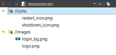
/images prefix. Don’t forget to save once you’re done by pressing Ctrl + S. Your .qrc file should now look like this:
Figure 1.13 – Showing the structure of the resource file
- Go back to the
mainwindow.ui file; let’s make use of the resources we have just added to our project. Select the restart button located on the top panel. Scroll down the Property Editor area until you see the icon property. Click the little button with a drop-down arrow icon and click Choose Resources from its menu.
- The Select Resource window will pop up. Click on the icons prefix on the left panel and select the restart icon on the right panel. Press OK.
- A tiny icon will appear on the button. This icon looks very tiny because the default icon size is set to
16 x 16. Change the iconSize property to 50 x 50; you will see that the icon appears bigger. Repeat the preceding steps for the shutdown button, except this time, choose the shutdown icon instead.
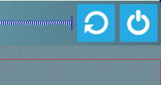
- The two buttons should now look like this:
Figure 1.14 – Applying icons to the push buttons
- Let’s use the image we added to the resource file as our logo. Select the logo widget and remove the style sheet that we added earlier to render its outline.
- Scroll down the Property Editor area until you see the pixmap property.
- Click the little drop-down button behind the pixmap property and select Choose Resources from the menu. Select the logo image and click OK. The logo size no longer follows the dimension you set previously; it follows the actual dimension of the image instead. We cannot change its dimension because this is simply how the pixmap property works.
- If you want more control over the logo’s dimension, you can remove the image from the pixmap property and use a style sheet instead. You can use the following code to apply an image to the icon container:
border-image: url(:/images/logo.png);
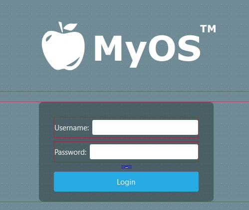
- To obtain the path of the image, right-click the image’s name in the file list window and choose Copy path. The path will be saved to your operating system’s clipboard; now, you can just paste it into the preceding style sheet. Using this method will ensure that the image fits the dimensions of the widget that you applied the style to. Your logo should now appear like what’s shown in the following screenshot:
Figure 1.15 – The logo is now appearing at the top of the login form
- Apply the wallpaper image to the background using a style sheet. Since the background dimension will change according to the window size, we cannot use pixmap here. Instead, we will use the
border-image property in a style sheet. Right-click the main window and select Change styleSheet... to open the Edit Style Sheet window. We will add a new line under the style sheet of the centralWidget widget:#centralWidget {
background: rgba(32, 80, 96, 100);
border-image: url(:/images/login_bg.png);
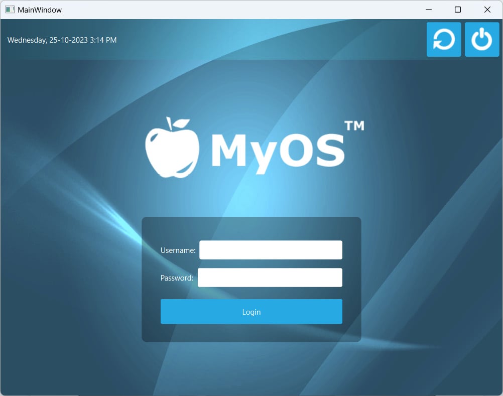
} - It’s really that simple and easy! Your login screen should now look like this:
Figure 1.16 – The final result looks neat
How it works…
The resource system in Qt stores binary files, such as images and translation files, in the executable when it gets compiled. It reads the resource collection files (.qrc) in your project to locate the files that need to be stored in the executable and include them in the build process. A .qrc file looks something like this:
<!DOCTYPE RCC>
<RCC version="1.0">
     <qresource>
           <file>images/copy.png</file>
           <file>images/cut.png</file>
           <file>images/new.png</file>
           <file>images/open.png</file>
           <file>images/paste.png</file>
           <file>images/save.png</file>
     </qresource>
</RCC>
It uses XML format to store the paths of the resource files, which are relative to the directory that contains them. The listed resource files must be located in the same directory as the .qrc file, or one of its subdirectories.


 Free Chapter


