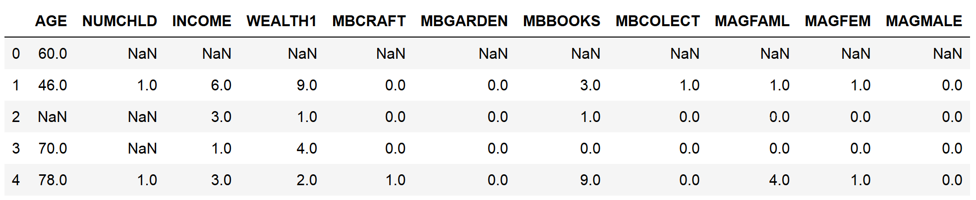
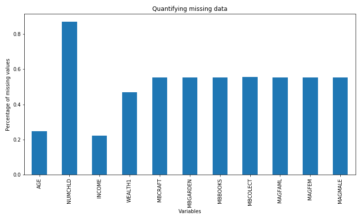
Missing data refers to the absence of a value for observations and is a common occurrence in most datasets. Scikit-learn, the open source Python library for machine learning, does not support missing values as input for machine learning models, so we need to convert these values into numbers. To select the missing data imputation technique, it is important to know about the amount of missing information in our variables. In this recipe, we will learn how to identify and quantify missing data using pandas and how to make plots with the percentages of missing data per variable.
-
Book Overview & Buying
-
Table Of Contents

-
Feedback & Rating

Python Feature Engineering Cookbook
By :
Python Feature Engineering Cookbook
By:
Overview of this book
Feature engineering is invaluable for developing and enriching your machine learning models. In this cookbook, you will work with the best tools to streamline your feature engineering pipelines and techniques and simplify and improve the quality of your code.
Using Python libraries such as pandas, scikit-learn, Featuretools, and Feature-engine, you’ll learn how to work with both continuous and discrete datasets and be able to transform features from unstructured datasets. You will develop the skills necessary to select the best features as well as the most suitable extraction techniques. This book will cover Python recipes that will help you automate feature engineering to simplify complex processes. You’ll also get to grips with different feature engineering strategies, such as the box-cox transform, power transform, and log transform across machine learning, reinforcement learning, and natural language processing (NLP) domains.
By the end of this book, you’ll have discovered tips and practical solutions to all of your feature engineering problems.
Table of Contents (13 chapters)
Preface
Foreseeing Variable Problems When Building ML Models
 Free Chapter
Imputing Missing Data
Encoding Categorical Variables
Transforming Numerical Variables
Performing Variable Discretization
Working with Outliers
Deriving Features from Dates and Time Variables
Performing Feature Scaling
Applying Mathematical Computations to Features
Creating Features with Transactional and Time Series Data
Extracting Features from Text Variables
Other Books You May Enjoy
Customer Reviews