-
Book Overview & Buying
-
Table Of Contents

-
Feedback & Rating

Clojure for Data Science
By :
Clojure for Data Science
By:
Overview of this book
The term “data science” has been widely used to define this new profession that is expected to interpret vast datasets and translate them to improved decision-making and performance. Clojure is a powerful language that combines the interactivity of a scripting language with the speed of a compiled language. Together with its rich ecosystem of native libraries and an extremely simple and consistent functional approach to data manipulation, which maps closely to mathematical formula, it is an ideal, practical, and flexible language to meet a data scientist’s diverse needs.
Taking you on a journey from simple summary statistics to sophisticated machine learning algorithms, this book shows how the Clojure programming language can be used to derive insights from data. Data scientists often forge a novel path, and you’ll see how to make use of Clojure’s Java interoperability capabilities to access libraries such as Mahout and Mllib for which Clojure wrappers don’t yet exist. Even seasoned Clojure developers will develop a deeper appreciation for their language’s flexibility!
You’ll learn how to apply statistical thinking to your own data and use Clojure to explore, analyze, and visualize it in a technically and statistically robust way. You can also use Incanter for local data processing and ClojureScript to present interactive visualisations and understand how distributed platforms such as Hadoop sand Spark’s MapReduce and GraphX’s BSP solve the challenges of data analysis at scale, and how to explain algorithms using those programming models.
Above all, by following the explanations in this book, you’ll learn not just how to be effective using the current state-of-the-art methods in data science, but why such methods work so that you can continue to be productive as the field evolves into the future.
Table of Contents (12 chapters)
Preface

 Free Chapter
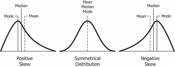
1. Statistics
2. Inference
3. Correlation
4. Classification
5. Big Data
6. Clustering
7. Recommender Systems
8. Network Analysis
9. Time Series
10. Visualization
Index
Customer Reviews