A geodatabase is the primary data storage format for the ArcGIS platform, which includes ArcGIS Pro. So much of the data that you will visualize, edit, and analyze using ArcGIS Pro will come from a geodatabase. There are several types of geodatabases, including personal, file, enterprise, and mobile.
A geodatabase stores related features as feature classes. A feature class is a collection of features that share the same geometry (point, line, polygon, annotation, or multipatch), attribute table, and coordinate system. A feature class can then be added as a layer to a map so that you can see both the spatial and tabular data. To take a deeper dive into the geodatabase format, go to https://pro.arcgis.com/en/pro-app/latest/help/data/geodatabases/overview/what-is-a-geodatabase-.htm.
In this recipe, you will act as a GIS analyst for the City of Trippville. The city manager has asked you to create a simple map showing some basic information about the city, including city limits, roads, railroads, and points of interest.
Getting ready
This recipe requires the sample data to be installed on your computer. It is recommended that you complete the recipes in Chapter 1, ArcGIS Pro Capabilities and Terminology, before starting this recipe. This will ensure you have a better foundational understanding of navigating within a map. You can complete this recipe with any ArcGIS Pro licensing level.
How to do it...
In this recipe, you will add the required layers to a map using different methods and then configure them.
Opening ArcGIS Pro and a project
To start, you must launch the ArcGIS Pro application and open a project. Follow these steps:
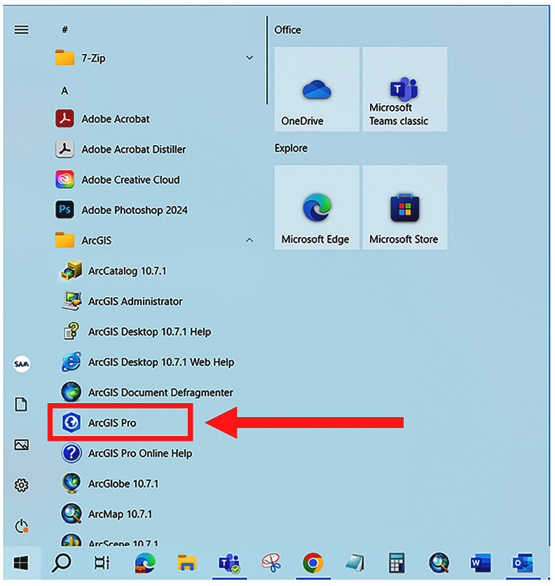
- Start ArcGIS Pro by clicking on the Start menu button. Then if you are running Windows 10, expand the ArcGIS Program Group and select ArcGIS Pro as shown in the following screenshot. If you are running Windows 11, you will need to click on the All apps button before you expand the ArcGIS program group.
Figure 2.1 – Starting ArcGIS Pro from the Start button
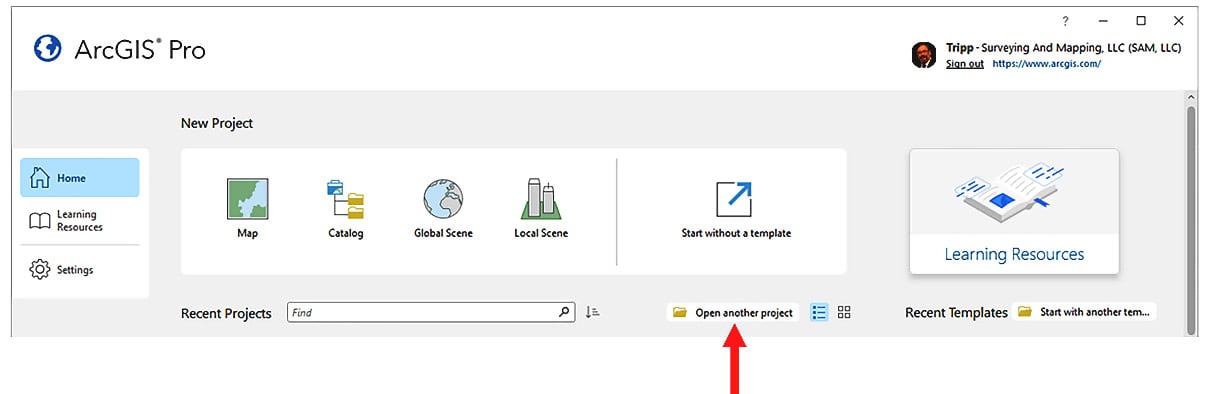
- In the ArcGIS Pro Start window, click on the Open another project button, as illustrated here:
Figure 2.2 – Open another project
- In the Open Project window, expand the Computer option in the left panel. Then, in the right panel, scroll down and double-click on the C: drive. It might be labeled as Local Disk, Local Drive, or OS.
- Double-click on the
Student folder, followed by the ArcGISPro3Cookbook and Chapter 2 folders.
- Double-click on the
AddingLayers folder and select the AddingLayers.aprx project file. Then, click the OK button to open the project.The project you selected should open with a single map. This map will contain a basemap but no other layers.
Adding layers to a map using the Add Data button
You will now begin adding the requested layers to this map. You will start with the city limits:
- Activate the Map tab in the ribbon.
- Click on the Add Data button.
- In the Add Data window that just opened, expand the
Databases folder located under Project in the left panel.
- Double-click on the
Trippville_GIS.gdb geodatabase in the right panel of the window.
- Double-click on the
Base feature dataset.
Information
Feature datasets are organizational units in a geodatabase. They act in a similar way as folders on your computer. They allow you to store related feature classes in a common container within the geodatabase so that you can easily find them. All feature classes stored within a feature dataset share the same coordinate system. This allows the feature classes stored in the feature dataset to take part in a topology and geometric network. Feature datasets only exist in geodatabases. You will not find them in other GIS data formats, such as shapefiles.
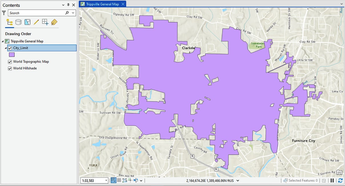
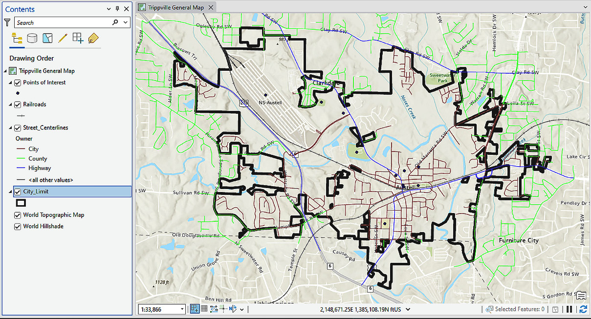
- Select the
City_Limit feature class. This is a polygon feature class. You can tell this by the icon located to the left of the feature class name. Click on the OK button to add this feature class to your map as a layer.Your map should look similar to what’s shown in the following screenshot. Upon adding the new layer, your map should have automatically zoomed into the area covered by the new layer. ArcGIS Pro assigns random colors when a new layer is added, so your City_Limit layer might be a different color:
Figure 2.3 – Map with the City_Limit layer added
Adding a new layer from the Catalog pane
Next, you will add the street centerlines to represent the roads in the city. You will use a different method to add this layer to the map:
- In the Catalog pane, which is normally docked to the right of the ArcGIS Pro interface, expand the
Databases folder.
- Next, expand the
Trippville_GIS.gdb geodatabase and then expand the Base feature dataset.
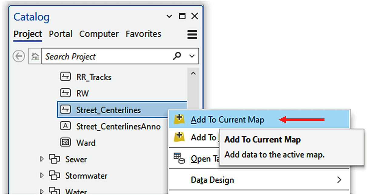
- Next, right-click on the
Street_Centerlines feature class and select Add To Current Map from the menu that appears, as illustrated here:
Figure 2.4 – Adding a feature class to a map from the Catalog pane
Street_Centerlines should now be visible on the map you are creating as a new layer. It should appear above the City_Limit layer in the Contents pane.
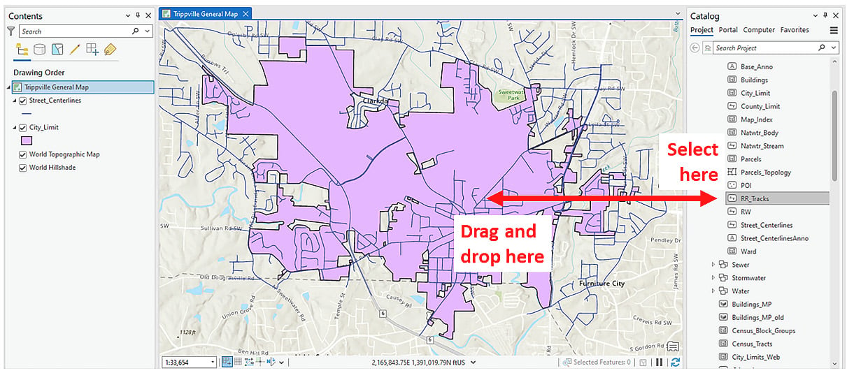
Dragging and dropping from the Catalog pane to add a new layer
There is another way you can add a feature class to a map as a layer from the Catalog pane: you can drag and drop the feature class from the Catalog pane into the map. You will use this method to add the RR_Tracks feature class to your map:
- In the Catalog pane, locate the
RR_Tracks feature class in the Trippville_GIS.gdb geodatabase and the Base feature dataset.
- Click on the
RR_Tracks feature class and then drag and drop it onto the map view area, as shown in the following screenshot:
Figure 2.5 – Dragging and dropping to add a layer to a map
The RR_Tracks layer will be added to your map as the Railroads layer. This is another method you haven’t used to add a new layer to your map. Now, you will add the last required layer to the map – points of interest.
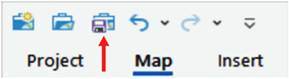
- Using either of the methods you have learned, add the
POI feature class to the map. This feature class is located in the Trippville_GIS.gdb geodatabase and the Base feature dataset.
- Save your project by clicking on the Save Project button located on the Quick Access toolbar in the top-left corner of the ArcGIS Pro interface:
Figure 2.6 – The Save Project button on the Quick Access toolbar
The POI feature class will appear as the Points of Interest layer in your map. Points of interest is an alias that is applied to the POI feature class when it is added to a map automatically. An alias is a more descriptive name that can be created as part of the properties of a feature class or database field name. The newly added layer should be located at the top of the layer list. Now that the layers have been added to the map, you need to configure them so that you can distinguish one layer from another.
Note
ArcGIS Pro will automatically order layers based on the layer’s geometry type. It will put points on top of lines, lines on top of polygons, and polygons on top of rasters as you add them.
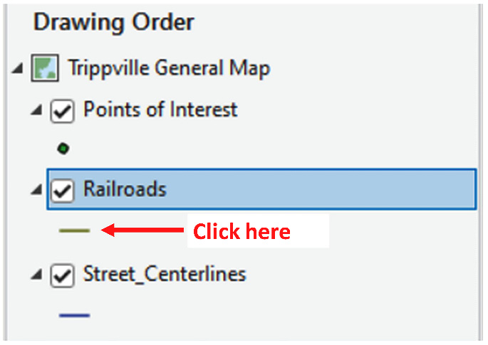
Changing basic symbology settings
Now that you’ve added multiple layers to your map, you need to change the symbology so that each layer is easily distinguishable from the others. ArcGIS Pro allows you to symbolize layers using several methods, depending on the layer’s purpose in the map and the data associated with that layer.
In this section, you will explore how to change simple symbology settings such as color, line type, and fill patterns, depending on the type of feature:
- Click on the small symbol patch located below the
Railroads layer, as shown in the following screenshot. This will open the Symbology pane:
Figure 2.7 – Clicking on the symbol patch to open the Symbology pane
- In the Symbology pane, click on the Gallery tab located near the top, just above the search cell. You should see many predefined symbology styles.
- Scroll through the various predefined symbols and select the Railroad symbol. It should be located in the ArcGIS 2D style.
- Click on the symbol patch located below the
City_Limit layer in the Contents pane.
- In the Symbology pane, verify that the Gallery tab is still active. Then, select the
Black Outline (2 Points) option located in the ArcGIS 2D style. The symbology for the City_Limit layer should change. It should now be displayed as a hollow polygon with a black outline.
- In the Symbology pane, click on the Properties tab.
- Change Outline width from
2 pt to 4 pt using the small up arrow. Then, click Apply.
- Close the Symbology pane.
- Save your project by clicking on the Save Project button located in the Quick Access toolbar on the top left of the ArcGIS Pro interface.
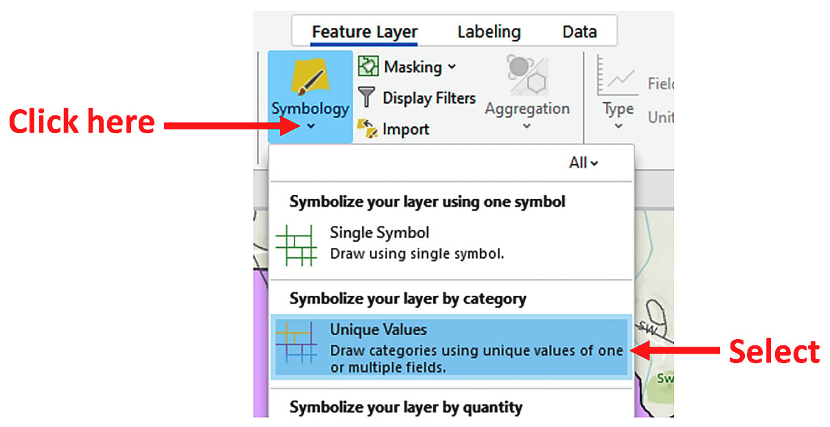
Using unique attribute values for symbology
You have just adjusted basic symbology settings for a layer that impacts all features contained in that layer. Now, you will set up a symbology that is based on unique attribute values contained in the layer’s attribute table:
- Select the
Street_Centerlines layer in the Contents pane.
- Click on the Feature Layer tab in the ribbon.
- Click on the small drop-down arrow located below the Symbology button and select Unique Values from the menu that appears, as illustrated here:
Figure 2.8 – Selecting Unique Values for symbology
- In the Symbology pane, set Field 1 to
RD_Class using the drop-down arrow. You should see that classes have been added for city, county, and highway in the lower section of the Symbology pane.
- Set Color scheme to Basic Random using the drop-down arrow.
Tip
There are two ways to see the names of the included color ramps. The first is to hover your mouse pointer over the color ramp; its name should be displayed as a small pop-up window. Second, you can check the box that says Show names. This will display the name of each color ramp above the graphic representation of that ramp.
- In the cell located just above the three symbol classes where it says
RD_Class, type Owner and press Enter. Watch what happens in the Contents pane under the Street_Centerlines layer.
- Close the Symbology pane and save your project.
Your map should now look as follows:
Figure 2.9 – Map with new layers added and some symbology configured
You have just configured the symbology for three of the four layers you’ve added to your map using two different methods. That leaves the Points of Interest layer.
Importing symbology settings from a layer file
You will use an existing layer file to not only update the symbology for the Points of Interest layer but also to apply label settings:
- Select the
Points of Interest layer in the Contents pane.
- Activate the Feature Layer tab in the ribbon. Then, click on the Import button.
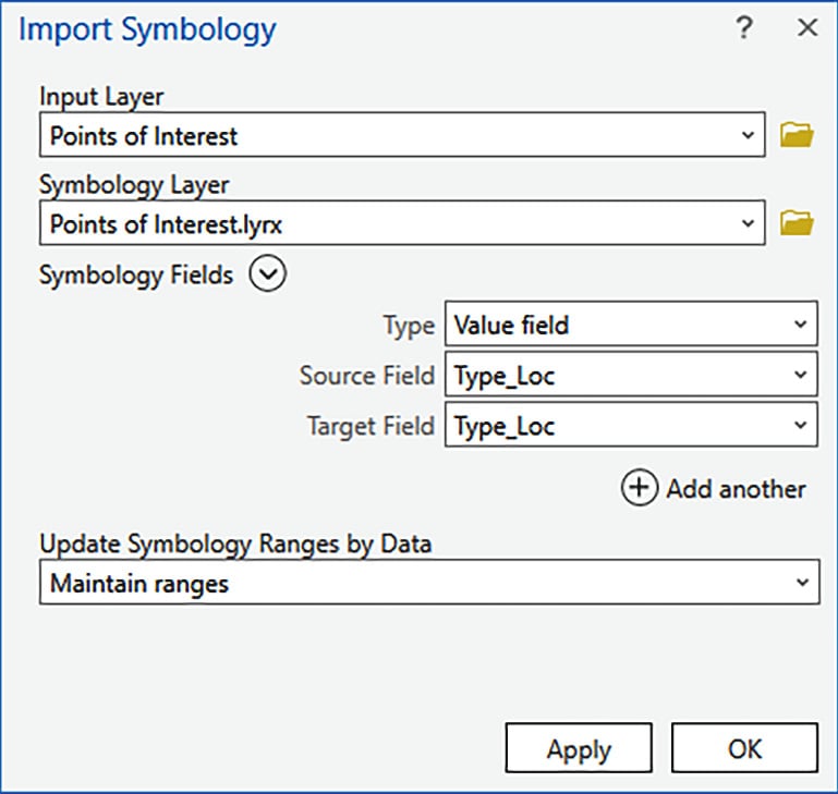
- In the Import Symbology tool that opens, Input Layer should automatically be set to
Points of Interest because that was the selected layer. Click the Browse button located to the right of Symbology Layer.
- In the Symbology Layer window that opens, click on Folders beneath Project in the left panel.
- Double-click on the
Adding Layers folder in the right panel of the window.
- Select the
Points of Interest.lyrx layer file and click OK. This should return you to the Import Symbology tool. The symbology layer should now be set to the layer file you just selected.
- Verify that your Import Symbology tool matches what’s shown in the following screenshot and click OK:
Figure 2.10 – Import Symbology with completed parameters
The symbology for the Points of Interest layer should now be set up to display based on the location type for each feature. By importing the settings from the layer, you did more than just update the symbology, as you will see next.
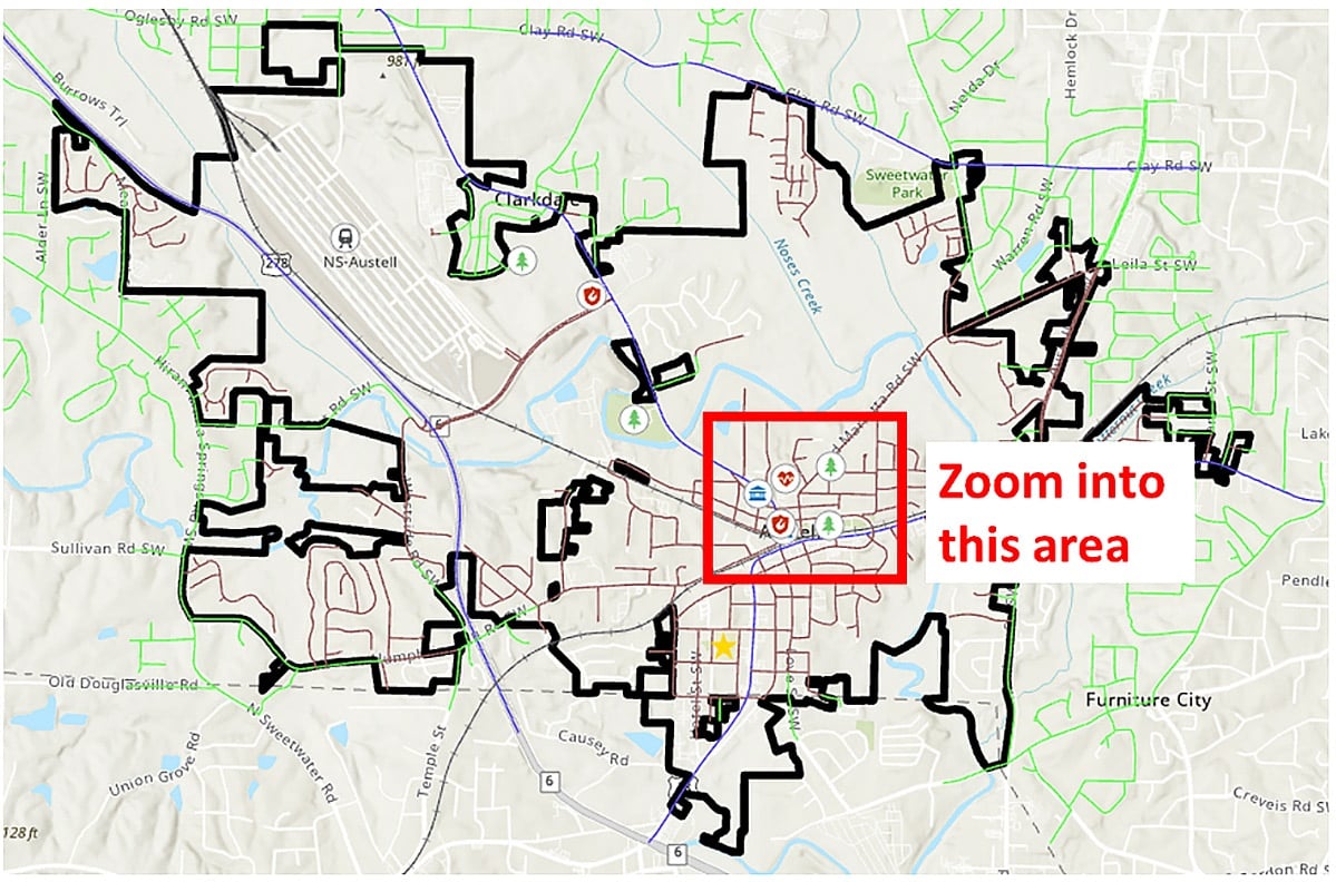
- Activate the Map tab in the ribbon and select the Explore tool.
- Zoom the map into the
Points of Interest features grouped in the center of town, as shown here:
Figure 2.11 – Zoom into this area
As you zoom in to this area, text labels should appear showing the name of each point of interest. The label settings for this layer were also applied when you imported the symbology from the layer file.
You will now manually configure labels for the Street_Centerlines layer:
- Select the
Street_Centerlines layer in the Contents pane.
- Activate the Labeling tab in the ribbon. Then, click on the Label button on the far-left end of the ribbon.
The text should appear on your map just above each street centerline feature. If you look at the text, you may notice it is incomplete. It does not show the full name of each road segment. It is missing the suffix that identifies if it is a street, circle, court, avenue, or lane. Also, some labels overlap with other features. You will now adjust some settings to see whether you can improve how the labels are displayed:
- Set the Field option located in the Label Class group on the Labeling tab to
Label_Name using the drop-down arrow. You should see the labels for the Street_Centerlines features change so that they now include the suffix.
Information
Labels are dynamic text that ArcGIS Pro will automatically generate and display based on values found in the attribute table of the layer. You can also build expressions using various programming languages, including Arcade, Python, VBScript, and JScript. To learn more about labeling in ArcGIS Pro, go to https://pro.arcgis.com/en/pro-app/latest/help/mapping/text/labeling-basics.htm.
- Next, in the Label Placement group on the Labeling tab, select North American Streets. The labels should shift when you select this placement option so that they are cleaner and easier to read.
- In the Visibility Range group, set Out Beyond to <Current> using the drop-down arrow. This will be populated with the current zoom scale of your map. The exact value will depend on the size of your monitor, the area you are zoomed into, and what panes are open, but it should be between 1:3200 and 1:4000.
- Activate the Map tab in the ribbon and select the Explore tool. Use the scroll wheel on your mouse to zoom in and out of the map. Watch what happens to the labels for the
Street_Centerlines layer.
- Save your project and close ArcGIS Pro.
As you zoom in and out of the map, you should see that the labels turn on and off automatically based on your view scale. Setting visibility scales such as this helps reduce clutter within a map, making it more readable.
How it works…
In this recipe, you added four feature classes from a geodatabase to a map as new layers. You did this using three methods:
- The first method was using the Add Data button on the Map tab in the ribbon. This method had you click on the Add Data button, which opened the Add Data window. Next, you navigated to the
Trippville_GIS.gdb geodatabase and expanded the Base feature dataset. From there, you selected the City_Limit layer and clicked OK. This created a new layer in your map that references back to the City_Limits feature class.
- The next method was adding the
Street_Centerlines feature class to the map from the Catalog pane. To do this, you expanded the Databases folder to access the Trippville_GIS.gdb geodatabase that was connected to the project. Then, you expanded the Base feature dataset. You located the Street_Centerlines feature class and right-clicked on it. Lastly, you selected the Add To Current Map option from the menu that appeared.
- The last method you used to add a feature class to a map as a layer also involved using the Catalog pane. You were able to simply select the
RR_Tracks feature class in the Catalog pane and drag and drop it into the map. This created a new Railroads layer in the map.
Once you added the new layers to your map, you had to configure them by setting up their symbology and labeling. You did this using the Feature Layer tab in the ribbon and by importing the settings from an existing layer file or manually setting them up.


 Free Chapter