-
Book Overview & Buying
-
Table Of Contents

-
Feedback & Rating

Data Science with Python
By :
Data Science with Python
By:
Overview of this book
Data Science with Python begins by introducing you to data science and teaches you to install the packages you need to create a data science coding environment. You will learn three major techniques in machine learning: unsupervised learning, supervised learning, and reinforcement learning. You will also explore basic classification and regression techniques, such as support vector machines, decision trees, and logistic regression.
As you make your way through the book, you will understand the basic functions, data structures, and syntax of the Python language that are used to handle large datasets with ease. You will learn about NumPy and pandas libraries for matrix calculations and data manipulation, discover how to use Matplotlib to create highly customizable visualizations, and apply the boosting algorithm XGBoost to make predictions. In the concluding chapters, you will explore convolutional neural networks (CNNs), deep learning algorithms used to predict what is in an image. You will also understand how to feed human sentences to a neural network, make the model process contextual information, and create human language processing systems to predict the outcome.
By the end of this book, you will be able to understand and implement any new data science algorithm and have the confidence to experiment with tools or libraries other than those covered in the book.
Table of Contents (10 chapters)
About the Book

 Free Chapter
Introduction to Data Science and Data Pre-Processing
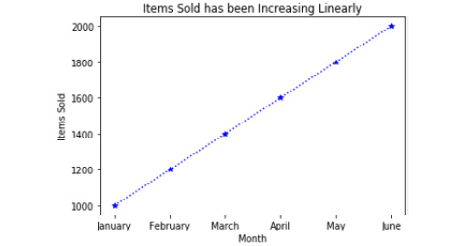
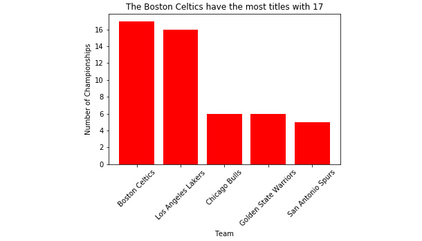
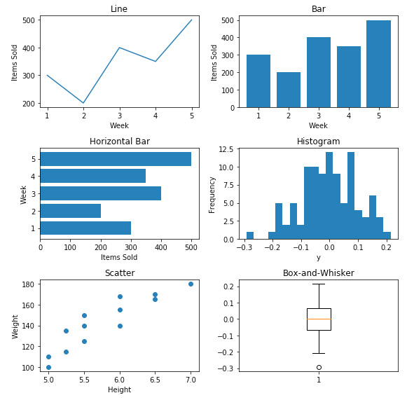
Data Visualization
Introduction to Machine Learning via Scikit-Learn
Dimensionality Reduction and Unsupervised Learning
Mastering Structured Data
Decoding Images
Processing Human Language
Tips and Tricks of the Trade
Appendix
Customer Reviews