-
Book Overview & Buying
-
Table Of Contents

-
Feedback & Rating

Data Cleaning and Exploration with Machine Learning
By :
Data Cleaning and Exploration with Machine Learning
By:
Overview of this book
Many individuals who know how to run machine learning algorithms do not have a good sense of the statistical assumptions they make and how to match the properties of the data to the algorithm for the best results.
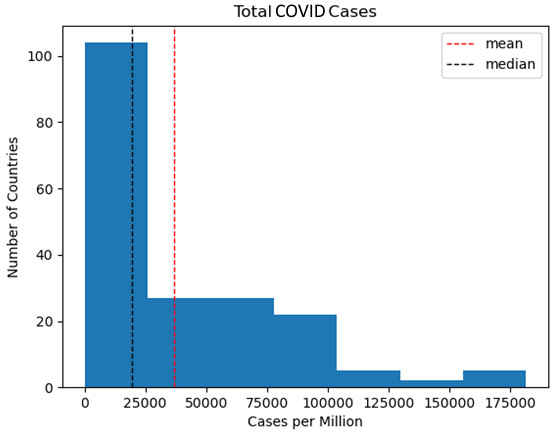
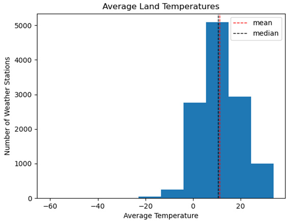
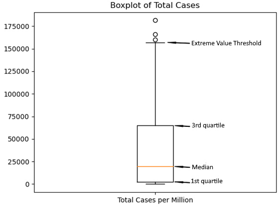
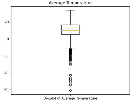
As you start with this book, models are carefully chosen to help you grasp the underlying data, including in-feature importance and correlation, and the distribution of features and targets. The first two parts of the book introduce you to techniques for preparing data for ML algorithms, without being bashful about using some ML techniques for data cleaning, including anomaly detection and feature selection. The book then helps you apply that knowledge to a wide variety of ML tasks. You’ll gain an understanding of popular supervised and unsupervised algorithms, how to prepare data for them, and how to evaluate them. Next, you’ll build models and understand the relationships in your data, as well as perform cleaning and exploration tasks with that data. You’ll make quick progress in studying the distribution of variables, identifying anomalies, and examining bivariate relationships, as you focus more on the accuracy of predictions in this book.
By the end of this book, you’ll be able to deal with complex data problems using unsupervised ML algorithms like principal component analysis and k-means clustering.
Table of Contents (23 chapters)
Preface

Section 1 – Data Cleaning and Machine Learning Algorithms
 Free Chapter
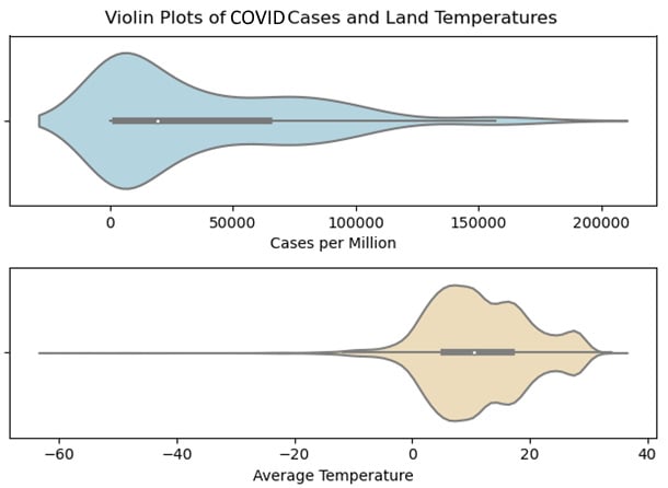
Chapter 1: Examining the Distribution of Features and Targets
Chapter 2: Examining Bivariate and Multivariate Relationships between Features and Targets
Chapter 3: Identifying and Fixing Missing Values
Section 2 – Preprocessing, Feature Selection, and Sampling
Chapter 4: Encoding, Transforming, and Scaling Features
Chapter 5: Feature Selection
Chapter 6: Preparing for Model Evaluation
Section 3 – Modeling Continuous Targets with Supervised Learning
Chapter 7: Linear Regression Models
Chapter 8: Support Vector Regression
Chapter 9: K-Nearest Neighbors, Decision Tree, Random Forest, and Gradient Boosted Regression
Section 4 – Modeling Dichotomous and Multiclass Targets with Supervised Learning
Chapter 10: Logistic Regression
Chapter 11: Decision Trees and Random Forest Classification
Chapter 12: K-Nearest Neighbors for Classification
Chapter 13: Support Vector Machine Classification
Chapter 14: Naïve Bayes Classification
Section 5 – Clustering and Dimensionality Reduction with Unsupervised Learning
Chapter 15: Principal Component Analysis
Chapter 16: K-Means and DBSCAN Clustering
Other Books You May Enjoy
Customer Reviews