Sign In Start Free Trial
Account

Add to playlist

Create a Playlist

Modal Close icon
You need to login to use this feature.
  • Book Overview & Buying Practical Data Analysis Using Jupyter Notebook
  • Table Of Contents Toc
  • Feedback & Rating feedback
Practical Data Analysis Using Jupyter Notebook

Practical Data Analysis Using Jupyter Notebook

By : Marc Wintjen
3.9 (9)
close
close
Practical Data Analysis Using Jupyter Notebook

Practical Data Analysis Using Jupyter Notebook

3.9 (9)
By: Marc Wintjen

Overview of this book

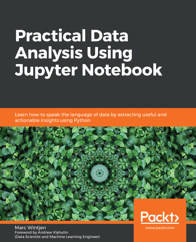
Data literacy is the ability to read, analyze, work with, and argue using data. Data analysis is the process of cleaning and modeling your data to discover useful information. This book combines these two concepts by sharing proven techniques and hands-on examples so that you can learn how to communicate effectively using data. After introducing you to the basics of data analysis using Jupyter Notebook and Python, the book will take you through the fundamentals of data. Packed with practical examples, this guide will teach you how to clean, wrangle, analyze, and visualize data to gain useful insights, and you'll discover how to answer questions using data with easy-to-follow steps. Later chapters teach you about storytelling with data using charts, such as histograms and scatter plots. As you advance, you'll understand how to work with unstructured data using natural language processing (NLP) techniques to perform sentiment analysis. All the knowledge you gain will help you discover key patterns and trends in data using real-world examples. In addition to this, you will learn how to handle data of varying complexity to perform efficient data analysis using modern Python libraries. By the end of this book, you'll have gained the practical skills you need to analyze data with confidence.
Table of Contents (18 chapters)
close
close
1
Section 1: Data Analysis Essentials
7
Section 2: Solutions for Data Discovery
12
Section 3: Working with Unstructured Big Data
16
Works Cited

Summary

Congratulations, we have now learned some essential skills for making various plots that visualize the distribution of data. We discussed key statistics related to the central tendency of data by calculating the standard deviation, mean, median, and mode of a series of data values. We looked at normal distributions and how data values can be skewed positively or negatively. When data has symmetry, it becomes easier to work with some algorithms found in predictive analytics. We reviewed patterns and outliers that are common when working with datasets, along with how to use a box plot chart to visualize outliers.

We discussed best practices and tips for working with geospatial data, along with how it can be used to help to tell a story with data. Finally, we discussed the difference between correlation versus causation along with the importance of the correlation coefficient, so you can understand the relationships between two variables/series of data values.

...
Unlock full access

Continue reading for free

A Packt free trial gives you instant online access to our library of over 7000 practical eBooks and videos, constantly updated with the latest in tech

Create a Note

Modal Close icon
You need to login to use this feature.
notes
bookmark search playlist download font-size

Change the font size

margin-width

Change margin width

day-mode

Change background colour

Close icon Search
Country selected

Close icon Your notes and bookmarks

Delete Bookmark

Modal Close icon
Are you sure you want to delete it?
Cancel
Yes, Delete

Delete Note

Modal Close icon
Are you sure you want to delete it?
Cancel
Yes, Delete

Edit Note

Modal Close icon
Write a note (max 255 characters)
Cancel
Update Note

Confirmation

Modal Close icon
claim successful

Buy this book with your credits?

Modal Close icon
Are you sure you want to buy this book with one of your credits?
Close
YES, BUY