Sign In Start Free Trial
Account

Add to playlist

Create a Playlist

Modal Close icon
You need to login to use this feature.
  • Book Overview & Buying Data Wrangling with R
  • Table Of Contents Toc
  • Feedback & Rating feedback
Data Wrangling with R

Data Wrangling with R

By : Gustavo R Santos, Gustavo Santos
4.9 (7)
close
close
Data Wrangling with R

Data Wrangling with R

4.9 (7)
By: Gustavo R Santos, Gustavo Santos

Overview of this book

In this information era, where large volumes of data are being generated every day, companies want to get a better grip on it to perform more efficiently than before. This is where skillful data analysts and data scientists come into play, wrangling and exploring data to generate valuable business insights. In order to do that, you’ll need plenty of tools that enable you to extract the most useful knowledge from data. Data Wrangling with R will help you to gain a deep understanding of ways to wrangle and prepare datasets for exploration, analysis, and modeling. This data book enables you to get your data ready for more optimized analyses, develop your first data model, and perform effective data visualization. The book begins by teaching you how to load and explore datasets. Then, you’ll get to grips with the modern concepts and tools of data wrangling. As data wrangling and visualization are intrinsically connected, you’ll go over best practices to plot data and extract insights from it. The chapters are designed in a way to help you learn all about modeling, as you will go through the construction of a data science project from end to end, and become familiar with the built-in RStudio, including an application built with Shiny dashboards. By the end of this book, you’ll have learned how to create your first data model and build an application with Shiny in R.
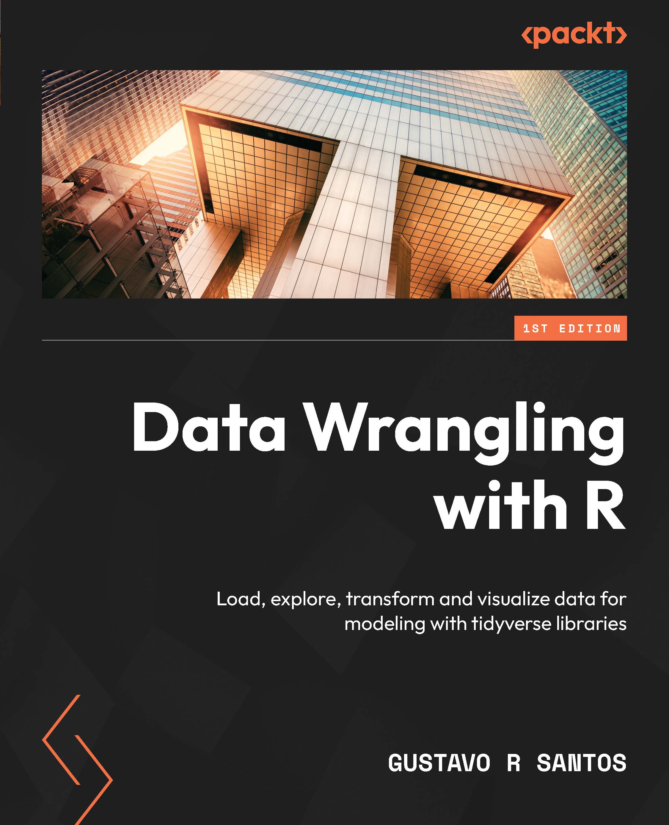
Table of Contents (21 chapters)
close
close
1
Part 1: Load and Explore Data
5
Part 2: Data Wrangling
12
Part 3: Data Visualization
16
Part 4: Modeling

Plotting graphics in Microsoft Power BI using R

Many business intelligence (BI) tools, such as Microsoft Power BI, have been developed and launched in the last few years. Microsoft’s tool appeared in 2014 and it currently accepts its own graphics and integrates with programming languages such as R and Python.

Working with BI tools is very practical. Most of what can be done in terms of visualization does not require coding; instead, you can just drag and drop variables to create graphics. However, like any other tool, there are pros and cons. For example, if we want to create a more customized graphic or add a type of graphic that is not available in Power BI, such as a histogram, we will have to adapt and look for an alternative to create that visualization. For that reason, we will learn how to plot a ggplot2 graphic in Power BI. It will give us the flexibility to make much more than the standard graphics provided by the BI tool.

Let’s see how to plot histograms...

Unlock full access

Continue reading for free

A Packt free trial gives you instant online access to our library of over 7000 practical eBooks and videos, constantly updated with the latest in tech
bookmark search playlist font-size

Change the font size

margin-width

Change margin width

day-mode

Change background colour

Close icon Search
Country selected

Close icon Your notes and bookmarks

Delete Bookmark

Modal Close icon
Are you sure you want to delete it?
Cancel
Yes, Delete

Confirmation

Modal Close icon
claim successful

Buy this book with your credits?

Modal Close icon
Are you sure you want to buy this book with one of your credits?
Close
YES, BUY