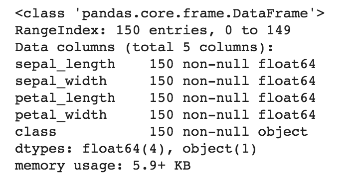
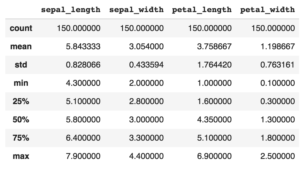
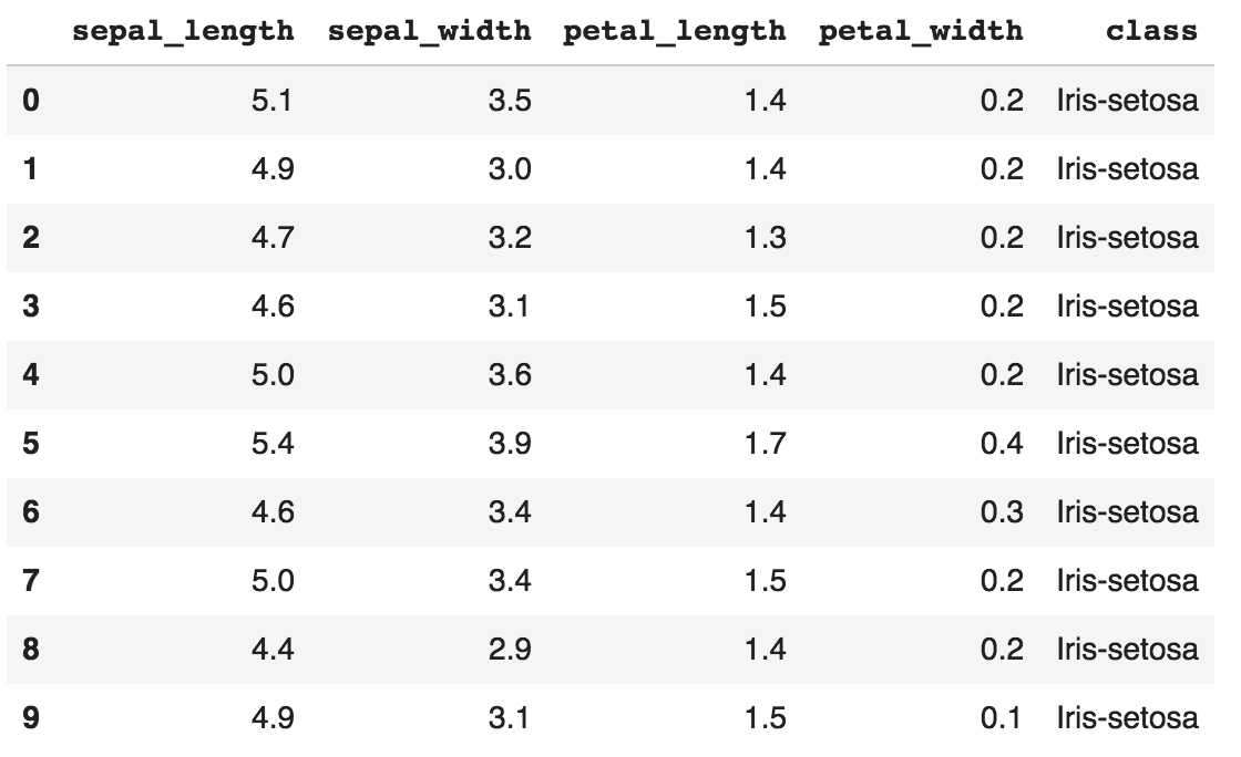
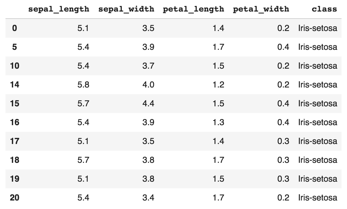
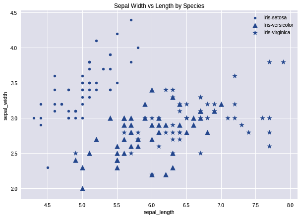
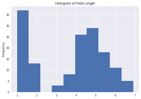
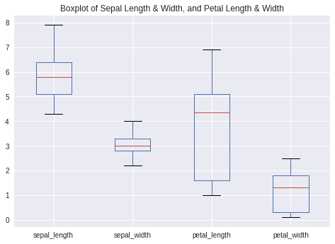
pandas is perhaps the most ubiquitous library in Python for data analysis. Built upon the powerful NumPy library, pandas provides a fast and flexible data structure in Python for handling real-world datasets. Raw data is often presented in tabular form, shared using the .csv file format. pandas provides a simple interface for importing these .csv files into a data structure known as DataFrames that makes it extremely easy to manipulate data in Python.
-
Book Overview & Buying

-
Table Of Contents

-
Feedback & Rating

Neural Network Projects with Python
By :
Neural Network Projects with Python
By:
Overview of this book
Neural networks are at the core of recent AI advances, providing some of the best resolutions to many real-world problems, including image recognition, medical diagnosis, text analysis, and more. This book goes through some basic neural network and deep learning concepts, as well as some popular libraries in Python for implementing them.
It contains practical demonstrations of neural networks in domains such as fare prediction, image classification, sentiment analysis, and more. In each case, the book provides a problem statement, the specific neural network architecture required to tackle that problem, the reasoning behind the algorithm used, and the associated Python code to implement the solution from scratch. In the process, you will gain hands-on experience with using popular Python libraries such as Keras to build and train your own neural networks from scratch.
By the end of this book, you will have mastered the different neural network architectures and created cutting-edge AI projects in Python that will immediately strengthen your machine learning portfolio.
Table of Contents (10 chapters)
Preface
 Free Chapter
Machine Learning and Neural Networks 101
Predicting Diabetes with Multilayer Perceptrons
Predicting Taxi Fares with Deep Feedforward Networks
Cats Versus Dogs - Image Classification Using CNNs
Removing Noise from Images Using Autoencoders
Sentiment Analysis of Movie Reviews Using LSTM
Implementing a Facial Recognition System with Neural Networks
What's Next?
Other Books You May Enjoy
Customer Reviews