Shape, color, and text are the absolute keys to logo design. In this section, you will learn a bit about the theory behind them, but we will focus on how to implement them in Inkscape! First, you will build the shape of your logo, then apply colors to your design. Finally, you will add text to finish the logo! Apart from these key steps, you will also learn a very efficient method for decision-making in Inkscape!
Step 1 – turning the sketch into a vector
Now that we have some ideas in the form of sketches, it is time to turn them into proper vector shapes. The cleaner the shapes of a logo, the better it will be. This creates simplicity and helps people understand the image. Clean shapes are also based on geometry. The simplest way to achieve pleasing geometrical proportions is to recognize the basic building block of your logo and use that in Inkscape to design it.
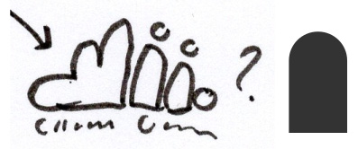
I picked the most creative from the sketches – the one built up from simple user icons while still resembling a cloud. Now, we have to recreate the winning sketch in Inkscape.
Take a look at our sketch and deconstruct it. It was purposefully built up from the basic shape of those well-known user icons we see everywhere. That user shape can be rebuilt using simple rounded rectangles and circles. You will have to create this shape first:
- Draw a tall rectangle and use the small circle handles at the corner to round it. Feel free to use any color at this stage; we will apply colors and gradients to the logo later on. If you want to draw over the sketch to check the proportions, set the object’s opacity to 50% for transparency. Otherwise, just keep it at 100% and draw your shapes next to the sketch:
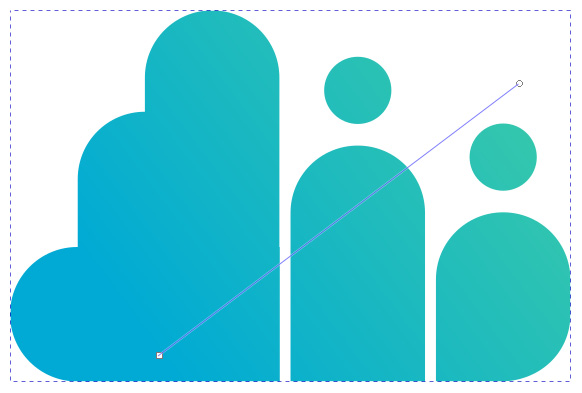
Figure 2.3 – The winning sketch and the basic shape of the logo design
- Draw another rectangle over the first one horizontally. Select both of them and choose Path | Difference by pressing Ctrl + - to cut the bottom of our first rounded rectangle off. This way, you will create the body of our user figure.
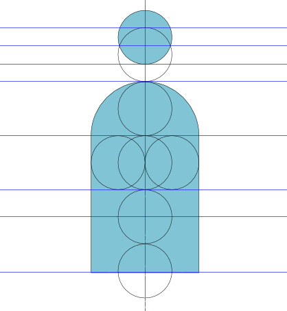
- Now, use the Circle tool and draw a head over this torso while holding Ctrl to create a perfect circle. In this design, keep the proportions shown in Figure 2.4.
- Set the size of the head to half of the width of the torso. Then, use the Path editor tool and adjust the height of the body to be 3.5 times the size of the circle. From now on, for this logo, we will use the size of the circle as one head unit, to keep the measurements and proportions right.
Tip
When editing the body shape, only move the two bottom nodes up or down with the Path editor tool. Do not use the Transform tool, as this will stretch it and change the proportion of the whole shape. This is an important tip to remember when you create a design based on different variations of the same object.
- Press Shift + Ctrl + A to open the Align and Distribute window. Select both the head and the body, and center them on the vertical axis by clicking on the corresponding icon in the Align and Distribute dialog window. The tooltip of the icon says Center on vertical axis. Set the distance between the head and the body to be about a third of the diameter of the head circle. With that, you have finished creating the first user shape for your logo design:
Figure 2.4 – Proportions of the two elements in the user shape
Now, create the second user shape. According to our sketch, this has to be shorter than the other so that it can build up the cloud shape illusion. Plus, it will look like a sitting figure compared to the taller one:
- Select both the body and head of the first figure and group them by pressing Ctrl + G. Now, duplicate them by pressing Ctrl + D and put them next to the first one.
- Set the distance between the two users to half of the distance between the head and the torso. If the body height of the taller figure was 3.5 head units, set the body height of this one to 2.5 head units using the Path editor tool!
- Select the two users and put them on the same baseline via the Align bottom edges icon in the Align and Distribute dialog. Notice how the measurements are lining up: the shorter figure reaches the chin of the higher one. That is the point of creating geometry and structure!
Tip
Remember, using the same measurements and shapes again and again will create harmony in all your logo designs. Plus, it is very effective, since you only have to figure out the rules and distances once in each project; you don’t have to measure and create them from scratch over and over every time you add a new shape to it!
Figure 2.5 – The two users next to each other at this stage
Now that the user part of our logo is laid down, it’s time to focus on the cloud side. As I mentioned previously, your logo design is based around the same half-rounded rectangle shapes. You only need three more shapes to finish this simple logo design:
- Duplicate the taller user shape and pull this duplicate to the left.
- Set the distance between this and the original to the same as the distance you used before. This way, the user part and the cloud part will be a bit separated.
- The two parts of the duplicated user – the body and the circle – are grouped now, so ungroup them by right-clicking on this group and selecting Ungroup, or pressing Shift + Ctrl + G.
- Now, delete the circle here since you do not need that to create the cloud shape. What you need to do is make this remaining shape taller, to signal the peak of the cloud. Using the Path tool, select the top nodes of this shape and lift them until the height of the shape is 5.5 times the height of the head unit. This height difference between the cloud and user elements will create a geometric triangle shape with harmonic proportions.
- To create the second cloud shape, just duplicate the one you just made, and pull the duplicate to the left. You want to keep the users separated and recognizable as independent human forms but want to show the cloud parts as one piece. The reason is the same: you need the cloud to be one visual mass and recognizable as a cloud. So, this time, do not set the duplicated shape apart from the other shape! Let them overlap halfway, with the edge of the original cloud shape running at the center line of the duplicate.
- Now, using the Path editor tool again, grab the top nodes of the new shape and set the height of it to four head units. Check Figure 2.6 for how it all should look now:
Figure 2.6 – The cloud part of the logo is overlapping; the users stand separate
- Adding the last part of the cloud is tricky, but you will use the same building blocks you just used earlier. Duplicate the last shape you created and rotate it 90° counterclockwise so that it is laying on its side. The easiest way to do this is to hold the Ctrl key while rotating it.
- Select this last shape and the first cloud shape and use the Align and Distribute dialog to align the edges at the bottom and on the right-hand side. If you did everything correctly, you will have an almost rounded cloud shape ready! Well, almost, because the cloud illusion is not there yet:
Figure 2.7 – All the parts are ready, but the cloud illusion is not there yet
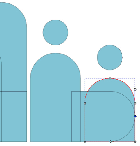
The piece that is breaking the illusion of the cloud is the user shape on the right edge. It has a straight and edgy bottom-right corner, not a rounded one like the cloud has on the left-hand side. By applying a curve here, you will fix the cloud illusion! Since the cloud curve on the left is the same shape as all the other ones in your logo, you can use that to shape your curve perfectly.
- Double-click the user shape on the right to go into the group.
- Now, select and duplicate the torso part of it and rotate it 90° clockwise (hold Ctrl for a perfectly horizontal result).
Selecting the original and the duplicated shapes aligns their bottom edges and their right-hand sides via the Align and Distribute dialog! The reason you had to do this was to use this shape as a blueprint to shape that straight edge into a perfect curve.
- From the View menu, from the Display modes, select Outline or Outline overlay.
- Select the original shape – the one with the corner – and add new nodes with the Path editor. Simply look where the path of your blueprint object starts, and double-click on the original path at the same two places:
Figure 2.8 – Curving the corner of this shape in Outline Overlay display mode
Tip
To measure and build your shapes here, I suggest using the Outline view, to see where the edges of your shapes are overlapping. Even better, Inkscape 1.0 introduced the Outline Overlay, which allows you to see not just the outlines but the fill colors of your vector shapes, making them easier to identify! Figure 2.8 shows the Outline overlay in work!
- Now, simply delete that one stray node in the bottom-right corner and shape the resulting curve to perfectly fit the blueprint path! When you are done, just delete the blueprint object since you do not need it anymore.
- Congratulations – the shapes of your logo are now ready! It has a more friendly and cloud-like appearance than before:
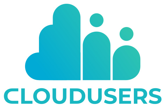
Figure 2.9 – The finished shape of the CloudUsers logo
Duplicating during the creative process
Although this chapter is a straightforward project for recreating one particular logo design for practice, it is worth mentioning at this point that there is another way Inkscape can serve you during the logo design process. The program lets you explore and create, giving you a safe space to develop your ideas further! It is a clean transition from experimenting with ideas on paper to experimenting with a more flexible digital canvas.
Any time you hit a decision point in your design work, where you think about changing the color, using a different font, changing a shape, and so on, instead of applying the changes straight on, create a duplication first!
We duplicate for two reasons: creativity and effectiveness. Stop wasting time imagining how the logo would look with another color! Duplicate it and test the two versions side by side in the same file! Then, move on to the version that works better for the project and keep working on that.
But keep the previous version as well – this way, if a change does not work out, you can easily find any previous versions and start branching out from that again. This is an important part of my logo design workflow.
I use duplication to create a whole tree of logos branching out into different versions of the same logo. This is a rule you should try to keep in your design process, and never apply hard changes to the same design.
How to implement this method
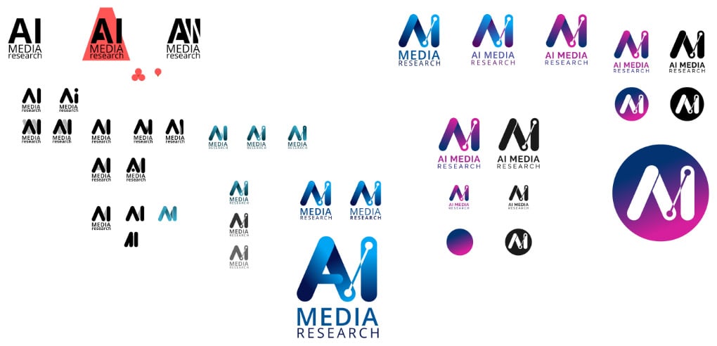
If you need a new version, just select all the elements of your current logo, and hit Ctrl + D to duplicate it. Then, holding the Ctrl key, move the duplicated version forward horizontally or vertically. This way, you will create an easily accessible tree of different versions. Here is a real-life example of how my average Inkscape logo design file looks while testing different logo ideas for one of my clients, AI media research.
The flexibility of the Inkscape interface allowed me to be flexible as well. You can experiment almost as freely as on paper – and sometimes even more. You can compare all the versions in a moment:
Figure 2.10 – This is how my average Inkscape logo design file looks while testing different logo ideas
When to use this method
As mentioned previously, whenever you need to make a decision. But more precisely, duplication is very useful, especially in the following cases:
- When you want to make changes to the shape of any logo element, such as its size, shape, position, and so on
- When you are choosing a color for your logo
- When you try different fonts or text placement in your logo
- When you merge elements in your logo design
- When you create different sizes and final versions of your logo
Step 2 – applying color and gradients to your logo
Everyone with a bit of interest in design has heard about color theory and the psychology of colors in logo design. The basic rule of simplicity also applies here: keep your color palette relevant but limited. Try to express the mood of your logo with as few colors as possible. Limiting the number of colors is also crucial for the usage of your logo design.
The fewer the colors, the easier it is to recognize the logo, but it also makes it easier to replicate it on any surface.
Colors in logo design are your ultimate device to express emotions and create a bond with the viewer. That is why it is important to research color samples for your project and look for different color moods to use in your logo before choosing the final colors.
If you find a color that you like, copy the three RGB values or the hexadecimal code of it into Inkscape, like you would do using any graphical program. A hexadecimal code is usually a # followed by six digits. But in Inkscape, you will see eight digits. That is because Inkscape is using RGBA.
RGBA stands for the RGB colors plus the Alpha value, which is the transparency of the given color in hexadecimal code. This is more information that can be handled with six digits, hence why you need eight. You can find this code in the Fill and Stroke dialog window, and it is the easiest way to copy colors from one place to the other.
Whenever you find a hexadecimal color code of six digits, just copy it into its place in Inkscape; the program will automatically add FF to the end of it to show it is a non-transparent color with a maximum Alpha value.
In this case, the cloud reminds us of the color of the sky, so blue is a good first choice. Also, most tech companies prefer a blue logo, since it stands for calmness, trust, and knowledge. To break the blue up a bit, you can also add another similar color and apply a gradient.
I picked turquoise since it is fresh and optimistic, and I aim to lighten up the tech part of the cloud for the human side of the logo. It is also good to have another color to work with later on while developing the rest of the visual identity. Gradients are trendy (yet again) and even a subtle gradient created from two fairly similar colors gives you a slight 3D effect.
The cloud logo is built up from multiple shapes, which gives you two options to apply a gradient. You can either select all the objects and merge them into one by selecting Path | Union before applying the gradient, or simply select the objects and group them before creating your gradient.
If you choose to merge the shapes, it is wise to duplicate your logo first, to keep the version with the separated elements as well, so that you can come back to it if you need to change something later.
Select the group of merged objects and apply a diagonal gradient of blue (RGBA: #0088aaff) and turquoise (RGBA: #37c8abff). Position the gradient handles inside the borders of the logo. This way, you will create a clean gradient with both colors visible at the edge, as shown in the following figure:
Figure 2.11 – Applying the gradient to the cloud logo diagonally
With that, you have added the primary colors. Now, let’s move on to adding text to your logo. You will color the text as well, and you will learn about creating the different color variants later in this chapter.
Step 3 – adding text to your logo and modifying letters for more personality
Every company or organization has a distinctive name, so, naturally, every logo needs a version containing that name.
As a designer, you have three choices when working with text in logo design:
- First, you can create a unique typeface for your logo. This can be achieved with Inkscape using the Path tools, as we did with the logo design. Creating this type of word art logo takes a lot of work and practice though, and most of the time, it only works well if the text in the logo is a short word or abbreviation.
- On the other hand, you can pick and use an existing font that matches the feeling of your logo design, and helps you convey the message better. The duplicating method mentioned previously works great with this in Inkscape, making it very easy to compare the different font variations.
- Your third choice lies in between those two: picking an existing font and tailoring it to your needs so that it matches your logo design better while you’re still maintaining a unique look.
We will use the third method with our CloudUsers logo design. You will modify an existing font so that it matches the shape of the cloud emblem we created earlier.
Because it is a small and friendly company, with other small and friendly companies as their target group, we will use a fresh and simple font for our text. The font family I chose is Montserrat, a sans-serif type font with several variations, including a bold style that fits the image of the CloudUsers logo almost perfectly.
Your task is to modify the shape of the letters a bit to turn that almost perfect into a perfect fit:
- First, type
CLOUDUSERS in capital letters under the cloud emblem you created.
- Place the text under the emblem and align it roughly to the vertical center of it. You will arrange it and find its final position later after you have changed the shape of the text.
- Select the text and set the font to Montserrat and the font weight to Bold. Feel free to use any color at this point as we will concentrate on the shapes for now.
Looking at the logo and the text in this state, you will notice that the letter C at the front is a bit off. Why? Do you remember the shape you created to build our cloud? That half-rounded rectangle is present in many letters in this clean and modern font.
This is yet another reason to use Montserrat as the typeface for this design: the letters U, D, and the curve of the letter R are all based on the same shape you based your logo on! But that letter C, although very nicely designed, could be forced to fit the other letters in the word. This is the letter you will modify, or, rather, recreate in a new form:
Figure 2.12 – This typeface fits the cloud image, but the C needs to be reshaped
To be able to modify the shape of the first letter, you need to turn the whole text into a path:
- Select the text object and turn it into a path by selecting Path | Object to Path from the menu, or pressing Shift + Ctrl + C.
- When you turn a piece of text into an editable path, all the letters inside the text object will turn into individual shapes, held together in a group. It is up to you to break up the group (by right-clicking it and choosing Ungroup or pressing Shift + Ctrl + G) or keep it and work inside it. You can enter a group by double-clicking it, or by pressing Ctrl and clicking on the object you need to modify.
Tip
Typography is the art of creating and arranging text. There is a whole list of visual rules a typo graphist has to follow while designing letters and typefaces. Only break these rules if it’s necessary to your design and try to keep the visuals of the text consistent. Modifying one of the original letters is a good way to keep your design inside these set rules, while other actions (for example, distorting a whole word by skewing it) are not.
- Select the original letter C and delete it. You could make your own version by using the shape on the left-hand side of the cloud, but it is easier to create something similar while reusing another letter already present. This way, you can also keep the thickness of the strokes and the shape of the letters in the text the same.
- Your goal is to recreate the shape on the left-hand side of the cloud. The best letter to use here is the D in CLOUD. Click on the letter D and duplicate it by pressing Ctrl + D.
- Then, move it in the place of the original C while holding Ctrl.
- Push H to flip it horizontally, then cut off the straight line in the mirrored letter D to open it up.
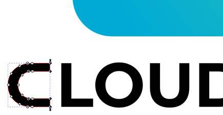
- Draw a rectangle over that vertical stem, select both the letter D and the rectangle, and select Path | Difference, or press Ctrl + -. This will cut the letter D into an almost perfect open C shape:
Figure 2.13 – Using a rectangle to cut a rotated letter D into a C
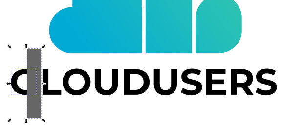
- After cutting off the right-hand side of the letter D, you will notice that the letter C you created looks shorter than the rest of the letters in the row and seems out of the picture. But since you are using this technique to keep your letters consistent, you need to fix this by selecting the nodes on the right of the letter C and moving them to the right until the letter is wide enough:
Figure 2.14 – Moving these nodes created a wider look for the letter C
The shape of your text is now much better, fitting the cloud shape on the left.
- To position your text, select the group containing the letters, or if you ungrouped the word earlier, group them again.
- Then, select the cloud emblem as well and center them on the vertical axis using the Arrange and Distribute dialog.
The only thing you need to do is apply the colors so that they match the cloud emblem. You used two colors as a diagonal gradient on the cloud emblem, and now you need to apply a color matching that. Instead of using the same gradient for the text, let’s apply another new color. But how do you decide on a color that is matching?
One of the easiest solutions is using the average color from the gradient present in the logo.
- Select the text, then use the Color picker tool on the emblem to get the color data from there.
- If you click and hold while using the Color picker tool, a circle will appear around your cursor, and Inkscape will calculate the average colors of the area inside the circle. This is a great tool to use here since it will produce a new color, but a color that is already there and is in harmony with your design. Feel free to use the color I picked for the text – its RGBA code is
#18b7c2ff:
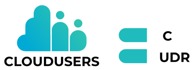
Figure 2.15 – The finished logo design with text and colors
Tip
Using the Color picker tool to extract the average color from any area works great in Inkscape. The only thing to note is to be careful about what is in that color selection circle since Inkscape gathers all the color information, including opacity and alpha values!
The main form of the CloudUsers logo is completed with a friendly geometrical shape and custom text, all presented in a fresh color. But as you know, the logo design process does not stop here. After the initial creative part has been completed, you need to work more to make your logo ready to use!


 Free Chapter