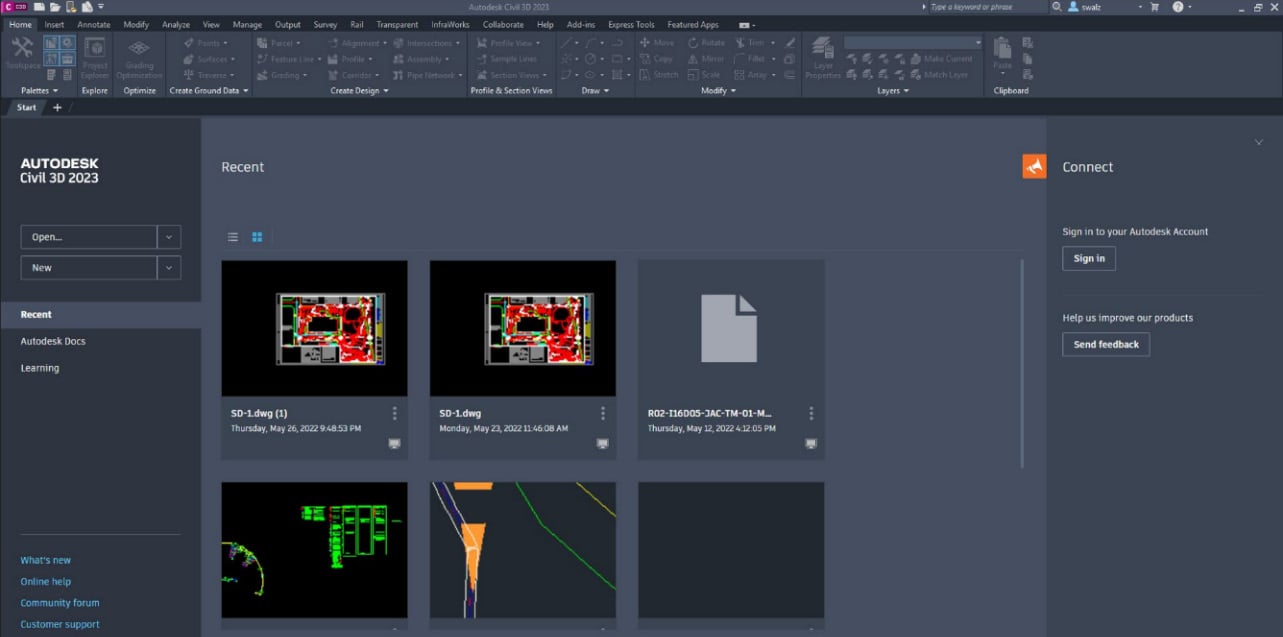
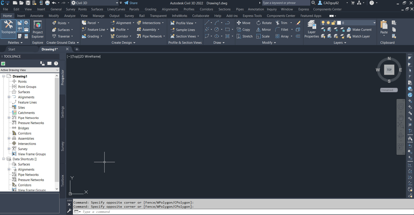
With all the introductions and background out of the way, let’s go ahead and jump into Autodesk Civil 3D and get acquainted with this BIM platform. When Autodesk Civil 3D is opened up or launched, you will be presented with the Start tab/screen, similar to that shown in Figure 1.1:
Figure 1.1 – User interface when Autodesk’s Civil 3D is launched
If we then select the + sign next to the Start tab, we will see we have essentially created our first drawing and will be presented with a screen similar to that shown in Figure 1.2:
Figure 1.2 – User interface after our first drawing has been created
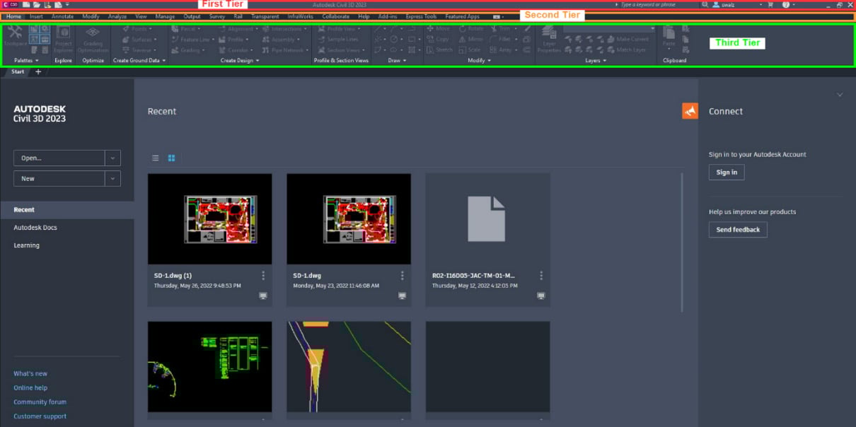
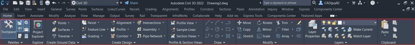
Along the very top of the program, you are presented with three levels of tools and functionality, as shown in Figure 1.3:
Figure 1.3 – Top three levels of tools and functionality within the user interface
Each of these levels provides varying access to the tools and functionality available within Autodesk’s Civil 3D platform. Much of this should be a bit clearer by the end of the section, as we dive into more detail about what is available at each level.
The first tier of the ribbon
In the first level at the very top, reading from left to right, we have access to the Menu browser, Quick Access Toolbar, Workspace and Quick Access Toolbar Customizations, Application and Drawing currently visible in the Drawing area, Quick Search Access to Autodesk’s Civil 3D Help, Autodesk Account Access, Overall Autodesk’s Civil 3D Help, and Quick program visibility access.
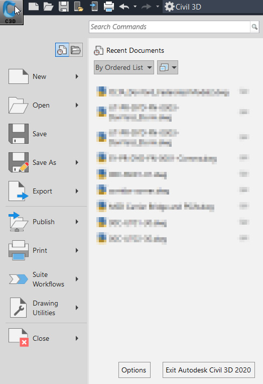
Starting with the Menu browser, which is indicated by the Civil 3D icon in the top-left corner of the program, you will be presented with a multitude of options that will provide some very high-level drawing management and functionality. Select the icon by left-clicking on your mouse (refer to Figure 1.4 for a detailed view of the Menu browser):
Figure 1.4 – Detailed view of the Menu browser
Running through the options presented along the left side of the Menu browser from the top to the bottom, the following list details what each area provides:
- New: This selection allows end users to create new drawings and sheet sets (more on sheet sets in Part 4 of the book).
- Open:This selection allows end users to open existing drawings (both locally or web and mobile-based), access Sheet Set Manager, import DGN files (Microstation format), import Industry Foundation Class (IFC) files, and open sample files (both locally or from online).
- Save: This selection allows end users to perform a quick save of their current drawing.
- Save As: This selection allows end users to save their current drawing as another drawing (both locally or web and mobile-based), drawing template file, drawing standards file, other formatted files (that is, DWG, DWDT, WS, and DXF), save the layout as a drawing file, and DWG Convert which will allow us to save to a DWG format that is compatible with earlier releases of Civil 3D).
- Export: This selection allows end users to export their current drawing to a DWF, DWFx, 3D DWF, another DWG version, DGN, DXF, PDF, IFC, and other file formats (that is, WMF, SAT, STL, EPS, DXX, BMP, IGES, and IGS).
- Publish: This selection allows end users to access the Send to Print service, Archive, eTransmit, Email, and Share View.
- Print: This selection allows end users to access Plot, Batch Plot, Plot Preview, View Plot and Publish Details, Page Setup, 3D Print, Manage Plotter, Manage Plot Styles, and Edit Plot Style Tables.
- Suite Workflows: This selection allows end users to access Workflow Manager, a dedicated area for common automated tasks.
- Drawing Utilities: This selection allows end users to access Drawing Properties, DWG Compare, Drawing Settings, Units, Audit, Status, Purge, Recover, Open the Drawing Recovery Manager, and Update Block Icons.
- Close: This selection allows end users to close the current drawing or all drawings.
Moving onto Quick Access Toolbar, we have a lot of the same options available to us as are within the Menu browser. However, instead of a drop-down menu like that of the Menu browser, we quick-select icons of tools and functionality that are typically common to everyday workflows:
Figure 1.5 – Quick Access Toolbar
Running through the stock, out-of-the-box Quick Access icons from left to right (as shown in Figure 1.5), we have the following:
- New
- Open
- Save
- Open from Web & Mobile
- Save to Web & Mobile
- Plot (print)
- Undo
- Redo
Note
Next to the Undo and Redo icons in Quick Access Toolbar, there are down arrows that will allow you to select the number of steps for which you would like to perform that operation on your drawing. By simply selecting the icon instead of the down arrow, you will perform that operation once for each click of the mouse. If you are intending to perform that operation multiple times, I recommend using the down arrow next to the icon to get the drawing back to the state that you are expecting.
If there are additional tools that are typical to your everyday workflow, there is a way to add them to your toolbar by simply right-clicking on the tool in the ribbon and selecting Add to Quick Access Toolbar.
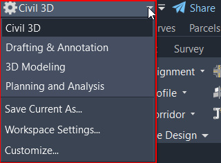
Next, we have the Workspace and Customized Quick Access toolbar. Here you can change the tools available in the ribbons on the third and fourth levels depending on the type of design and analysis you are looking to perform within the current drawing. To change from one workspace to another, you can select the down arrow icon next to the workspace name and select a different one as appropriate (see Figure 1.6).
Figure 1.6 – Workspace selections
Workspaces displayed and available include the following:
- Civil 3D: Tools displayed in the ribbon will provide you with the bulk of the tools necessary to perform civil engineering design and analysis.
- Drafting & Annotation: Tools displayed in the ribbon will provide you with the basic 2D drafting tools and functionality.
- 3D Modeling: Tools displayed in the ribbon will provide you with the basic 3D modeling tools and functionality. It’s important to note that 3D modeling capabilities within this display are not Civil 3D-related but are more intended for basic AutoCAD functionality.
- Planning and Analysis: Tools displayed in the ribbon will provide you with additional mapping and analysis tools. These tools come in handy when connecting to ArcGIS data.
- Save Current As…: Provides the ability to save any customizations you have made to a customized workspace that can be made current later on.
- Workspace Settings…: Selecting this option will pull up another dialog box that will allow you to define which workspaces are available, as well as the display order of the workspaces listed.
- Customize…: Selecting this option will pull up another dialog box that will allow you to customize any of your workspaces if necessary. This will come in handy if you intend to create custom tools, layouts, and so on specific to your workflow.
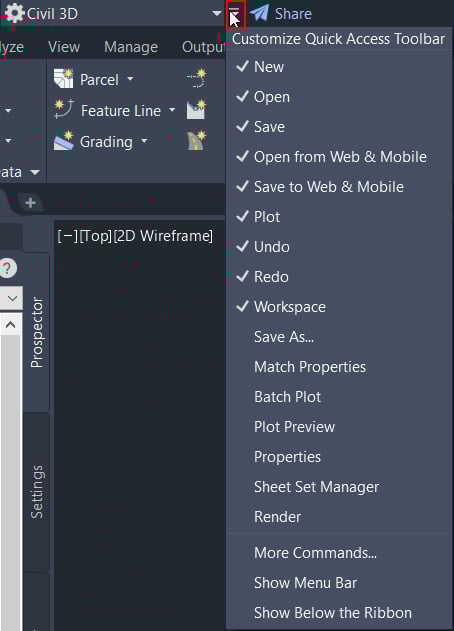
Directly next to the workspace selections is another down arrow with a horizontal line above it. If you select this, you will be presented with a drop-down menu that will provide the ability to customize Quick Access Toolbar and Tools Available within the overall ribbon interface (refer to Figure 1.7):
Figure 1.7 – Customize Quick Access Toolbar
Those items that are checked will be displayed in Quick Access Toolbar in your current view. You’ll notice that all of those checked in Figure 1.7 were those that were displayed when we were reviewing Quick Access Toolbar (Figure 1.5). The remaining tools listed in the top section are fairly straightforward and are typical commands and functionality that are relied on for a lot of workflows, hence the reason why they are listed as optional defaults in the list.
The last option in Quick Access Toolbar is an icon that looks like a paper airplane (see Figure 1.8). Selecting this icon will allow you to share the current drawing via a link to a web-based version. By default, the drawing is only available for 7 days.
Figure 1.8 – Share the drawing with a link
Next, we have Application and Drawing currently visible in the drawing area (refer to Figure 1.9). As you open or create and save new drawings, the drawing name displayed in this location will update accordingly.
Figure 1.9 – Application and Drawing
Then, we move on to Quick Search Access to Autodesk’s Civil 3D Help (refer to Figure 1.10). Any time you find yourself needing some quick help on a specific command, simply type the name of the command in this location and click on the magnifying glass icon next to it. After selecting the magnifying glass icon, another window will appear that contains the Civil 3D Help documentation and will present you with results that match the keyword or phrase you had typed into the field.
Figure 1.10 – Quick Search Access
Next up is Autodesk Account Access. Viewing from left to right, we first have Account Login and Details presented to you. When selecting the down arrow icon in the view (refer to Figure 1.11), you will have the ability to log out, view account details, explore purchase options, and manage licenses.
Figure 1.11 – Autodesk Account Access
Next to Autodesk Account Access (refer to Figure 1.12), we are presented with the option to connect to the Autodesk App Store (indicated by the shopping cart icon) and to connect to Civil 3D user networks via Facebook and Twitter:
Figure 1.12 – Autodesk App Store and user group networks
Continuing on, we have the overall Autodesk Civil 3D Help access, which is identified by the question mark icon (see Figure 1.13):
Figure 1.13 – Autodesk Civil 3D Help
And finally, we come to the quick program visibility access, where we have the ability to minimize the window of the program, restore and maximize the window of the program, and close the entire program:
Figure 1.14 – Quick program visibility
With the contents of the first tier behind us, let’s jump into the second tier.
The second tier of the ribbon
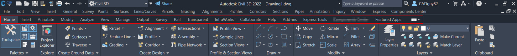
In the second level of the ribbon interface, we have the tabs that essentially group all of the tools and functionality available within Autodesk’s Civil 3D (refer to Figure 1.15). This grouping is meant to be an easy way to quickly access tools as you need them, instead of having to search through the drop-down menus for tools as needed.
Figure 1.15 – Second tier
Starting with the Home tab (refer to Figure 1.16), we have quick access to many of the major design tools and functionality that we will be leveraging through the BIM design life cycle:
Figure 1.16 – Home
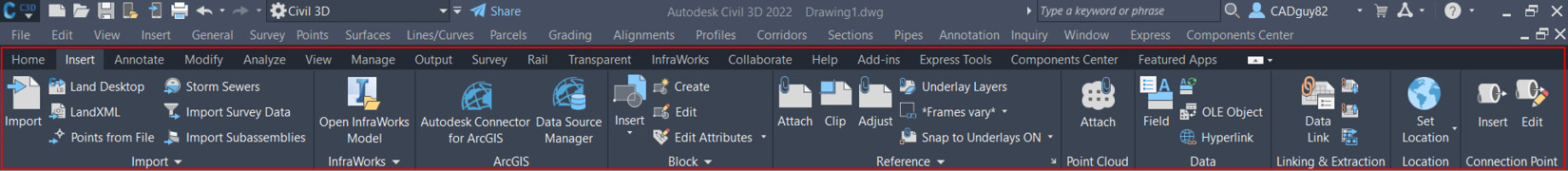
Next up is the Insert tab (refer to Figure 1.17), where we can quickly make connections to other types of files for reference purposes. Based on the type of file(s) being referenced, we can either keep these as static overlays being displayed or can make them live elements within our drawing area:
Figure 1.17 – Insert
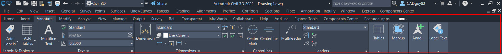
Next up is the Annotate tab (refer to Figure 1.18), where we can quickly add labels and text to various design elements:
Figure 1.18 – Annotate
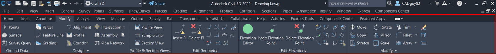
Next up is the Modify tab (refer to Figure 1.19), where we can quickly adjust design elements within the drawing:
Figure 1.19 – Modify
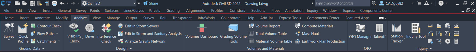
Next up is the Analyze tab (refer to Figure 1.20), where we can quickly access various reporting and computational tools and functionality available to us:
Figure 1.20 – Analyze
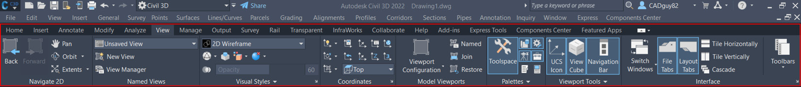
Next up is the View tab (refer to Figure 1.21), where we can quickly adjust our display settings of modeled elements in our drawing area:
Figure 1.21 – View
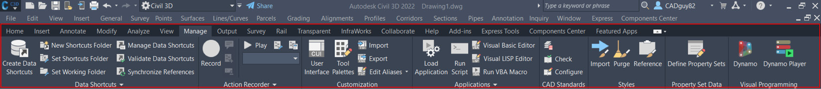
Next up is the Manage tab (refer to Figure 1.22), which, in a way, is more of a parking lot that provides quick access to a multitude of options, such as connecting to individual design elements from other Civil 3D files, performing customizations to the overall user interface, and file cleanup options:
Figure 1.22 – Manage
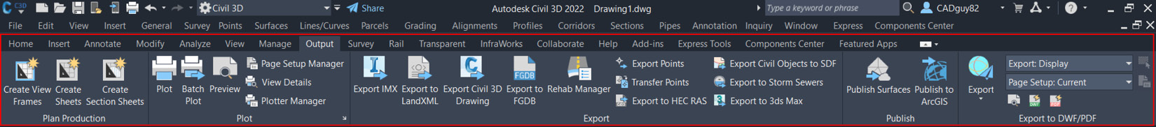
Next up is the Output tab (refer to Figure 1.23), where we can quickly export our drawing and individual design elements to a variety of formats:
Figure 1.23 – Output
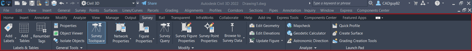
Next up is the Survey tab (refer to Figure 1.24), where we can quickly access various survey and mapping tools to support our BIM designs:
Figure 1.24 – Survey
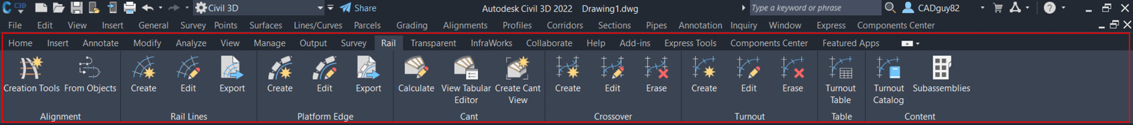
Next up is the Rail tab (refer to Figure 1.25), where we can quickly access BIM design capabilities related to Rail:
Figure 1.25 – Rail
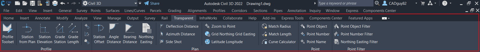
Next up is the Transparent tab (refer to Figure 1.26), where we can quickly access functionality that can be applied while performing various commands throughout our BIM design:
Figure 1.26 – Transparent
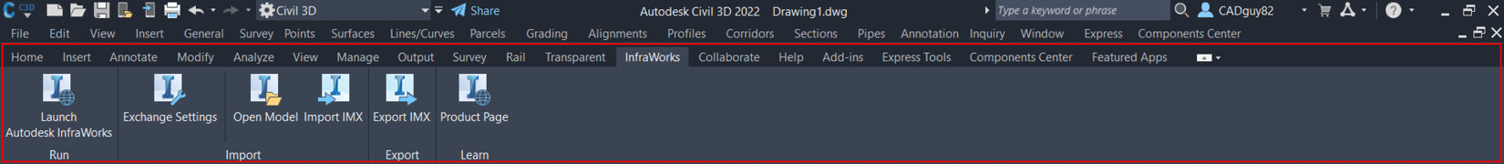
Next up is the InfraWorks tab (refer to Figure 1.27), where we can quickly connect to InfraWorks by importing/exporting design elements generated within either the Civil 3D or InfraWorks platform:
Figure 1.27 – InfraWorks
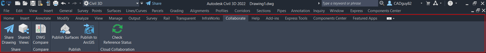
Next up is the Collaborate tab (refer to Figure 1.28), where we can quickly share our drawings and BIM design elements in various cloud-based environments:
Figure 1.28 – Collaborate
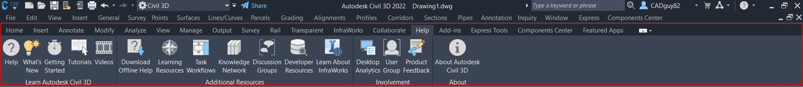
Next up is the Help tab (refer to Figure 1.29), where we can quickly access additional support as needed:
Figure 1.29 – Help
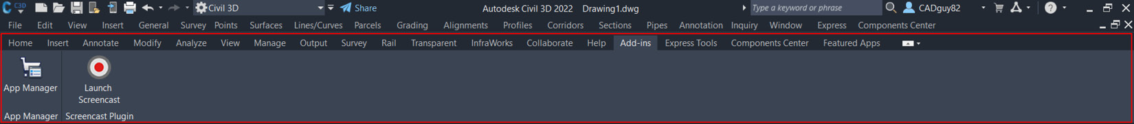
Next up is the Add-ins tab (refer to Figure 1.30), where we can quickly access any add-ins that are integrated with Civil 3D:
Figure 1.30 – Add-ins
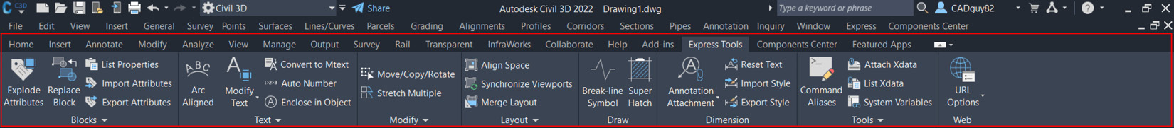
Next up is the Express Tools tab (refer to Figure 1.31), where we can quickly access various ad hoc tools:
Figure 1.31 – Express Tools
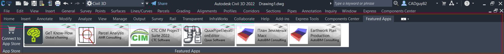
Next up is the Featured Apps tab (refer to Figure 1.32), where we can quickly access the Autodesk App Store to purchase and install leading add-ins being leveraged across the AEC industry:
Figure 1.32 – Featured Apps
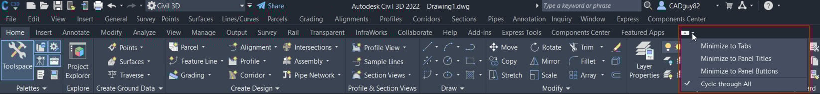
And finally, located at the very end of this tier just to the right of the Featured Apps tab is an icon that will give you the ability to cycle through the visibility states of the ribbon (as shown in Figure 1.33):
Figure 1.33 – Ribbon visibility states
Going back to what I said about the Menu bar visibility, depending on preference, you have the ability to either toggle on or off the tabs and panels display as well. Seeing as how the tabs and panels do consume a bit more real estate, or area, at the top of the session, you can minimize, even temporarily, to increase the space available in the drawing area as well (more on that in a bit). Ultimately, it comes down to preference of access and is in your hands to decide.
With the contents of the second level behind us, let’s jump into the third.
The third tier of the ribbon
In the third and final level of the ribbon interface, we have the panels that are categorized one more level down and provide access to the actual tools and functionality available within Autodesk’s Civil 3D (refer to Figure 1.34):
Figure 1.34 – Ribbon panel
It’s far more important, in my opinion, to fully understand the purpose and functionality of these tools when we review real-world design workflows and applications of tools. With that said, all of the tools and functionality within each of the tabs and panels will be covered in future sections and chapters within this book, so I won’t bore you with too much detail at this time. Please refer to Figures 1.15 to 1.33 for a high-level overview of what is included from a panel standpoint within each of the tabs.
Before moving on to the next area of the user interface, it is important to note that the ribbon we have been exploring is contextual, meaning it will change the commands that are visible on the ribbon depending on the command you are using or on what object is selected in the drawing. When an object is selected, the contextual ribbon will display commands directly related to the object you have selected in an attempt to expedite related workflows. Next, you can see the contextual ribbon in its default state, as shown in Figure 1.35:
Figure 1.35 – Contextual ribbon when a command or tool is not active
The following figure shows when a tool or command is active or when modeled components are selected in the drawing area:
Figure 1.36 – Contextual ribbon when a command or tool is active
The major differences between the displays are the tools and commands that will be made available above your drawing area. The intent of this contextual ribbon is to narrow down the tool selections to what can actually be performed with the identified objects. This eliminates all kinds of unnecessary time trying to remember where to locate tools and ultimately makes your work much easier.
With the contents of the third level behind us, let’s move on to the Toolspace.
Toolspace
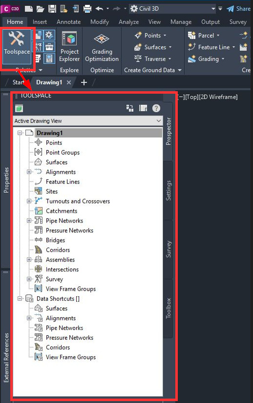
The next part of the user interface that we’ll review is Toolspace. This can be accessed by going to the Home tab and selecting the Toolspace icon in the Palettes panel. Once activated, you’ll notice TOOLSPACE being displayed along the left-hand side of your session (refer to Figure 1.37):
Figure 1.37 – Toolspace access
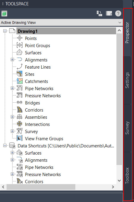
Within TOOLSPACE, you are presented with a ton of file and design management tools and functionality that will really drive your BIM design and the way modeled geometry and components are displayed. Along the right-hand side of your TOOLSPACE area, you’ll notice four individual tabs that will give you access to each type of functionality, Prospector, Settings, Survey, and Toolbox (refer to Figure 1.38):
Figure 1.38 – Toolspace tabs
Let’s look at each type of functionality:
- The Prospector tab provides you with the ability to create, modify, analyze, and manage modeled geometry and components within your drawing(s) open in the current session, as well as link modeled geometry and components from other files via Data Shortcuts Manager.
- The Settings tab provides you with the ability to create, modify, and manage settings specific to the drawing(s) open in the current session.
- The Survey tab provides you with the ability to connect to survey databases and manage configurations to streamline the integration of data within Autodesk’s Civil 3D platform.
- The Toolbox tab provides you with additional reporting and analysis tools that work well for gathering information within the current drawing and exporting data to various reporting formats.
With the contents of the toolspace reviewed, let’s now jump into the drawing area.
Drawing area
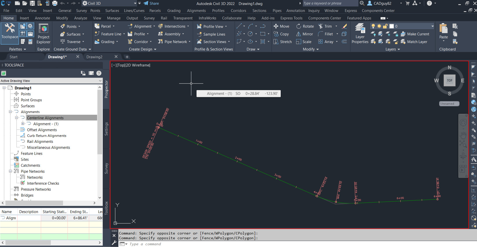
Moving on, the next area is the drawing area, which is fairly straightforward and self-explanatory. This area is reserved for your actual BIM design modeling, annotating, and so on. All your work will be displayed in this area and will appear as shown in this screenshot:
Figure 1.39 – Drawing area
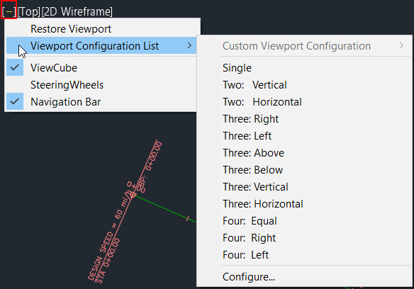
You’ll notice, however, a few different icons within your drawing area that are worth pointing out and providing a little more detail on. In the upper left-hand corner, you’ll notice a few view descriptions, similar to [-] [Top] [2D Wireframe]. When you select each of these fields, you are presented with the ability to further manage and/or change the display of all elements displayed in the drawing area. If you select the first field, [-], you are presented with a few options to customize the drawing area, or model space viewport (shown in Figure 1.40):
Figure 1.40 – Customize model space viewport
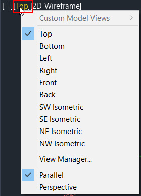
If you select the second field, [Top], you are presented with a few options to customize the orientation of the view being displayed within your model space viewport (shown in Figure 1.41):
Figure 1.41 – Model space viewport view orientation
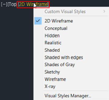
If you select the third field, [2D Wireframe], you are presented with the ability to change the overall display of your model geometry and components within the model space viewport (shown in Figure 1.42):
Figure 1.42 – Model space viewport display
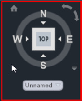
Let’s move over to the upper right-hand corner of your drawing area. This is where you’ll find ViewCube (refer to Figure 1.43), which allows you to quickly change the user coordinate system (UCS) and view orientation of components displayed in your drawing area. By selecting any of the lettered directions or the rotation options in the top right, or selecting any location on the square/cube located in the center, the view orientation will update as you select each of the options.
Figure 1.43 – ViewCube
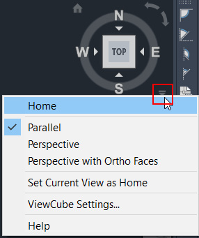
Additionally, if you select the down arrow toward the bottom right of ViewCube, you are presented with some additional view settings, along with display options for ViewCube itself (see Figure 1.44):
Figure 1.44 – ViewCube settings
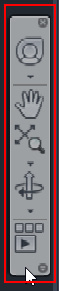
Lastly, just underneath ViewCube, you’ll notice a Quick View Access Bar, as shown in Figure 1.45. On this bar, we have the ability to quickly pull up the Full Navigation Wheel that will display right next to your mouse, pan across your drawing (represented by the hand icon), zoom in/out of your view, orbit/rotate your view along an axis, and ShowMotion, which allows you to create animations.
Figure 1.45 – Quick View Access Bar
With the contents of the drawing area reviewed, let’s move on to understanding the command line.
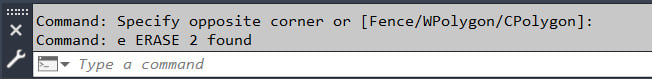
Command line
Last, but not least, we have the command line (refer to Figure 1.46). Any time you are in a command, and not presented with a dialog box, you will see the next steps for your command being displayed at the command line.
Figure 1.46 – Command line
It’s important to keep an eye on the command line if you are in doubt as to what the next step of your command is. Further, if you’re a “typer” like I am, this is also a great place to type any shortcuts of commands instead of trying to locate them within any of the menu dropdowns or sorting through the tools displayed in the ribbons. As an example, you can type the letters CO in the command line and hit Enter or the spacebar to initiate the Copy command, type the letter M and hit Enter or the spacebar to initiate the Move command, and so on.
Now that we have a high-level understanding of what tools are available to us and where they are located within the Autodesk Civil 3D environment, let’s jump into understanding the dynamic nature of the platform to get a little more of an idea as to how best we can leverage it in a BIM design setting.


 Free Chapter


