


Building web applications using Vue or any other JavaScript SPA framework revolves around the concept of breaking the UI down into the smallest possible chunks of functionality. These chunks are referred to as components, and can be likened to Razor view components, tag helpers, and partial views in ASP.NET Core MVC. However, in most SPAs, you'll end up breaking the UI down into far more pieces than you would in a traditional MVC application.
-
Book Overview & Buying
-
Table Of Contents

-
Feedback & Rating

ASP.NET Core 2 and Vue.js
By :
ASP.NET Core 2 and Vue.js
By:
Overview of this book
This book will walk you through the process of developing an e-commerce application from start to finish, utilizing an ASP.NET Core web API and Vue.js Single-Page Application (SPA) frontend.
We will build the application using a featureslice approach, whereby in each chapter we will add the required frontend and backend changes to complete an entire feature. In the early chapters, we’ll keep things fairly simple to get you started, but by the end of the book, you’ll be utilizing some advanced concepts, such as server-side rendering and continuous integration and deployment. You will learn how to set up and configure a modern development environment for building ASP.NET Core web APIs and Vue.js SPA frontends.You will also learn about how ASP.NET Core differs from its predecessors, and how we can utilize those changes to our benefit.
Finally, you will learn the fundamentals of building modern frontend applications using Vue.js, as well as some of the more advanced concepts, which can help make you more productive in your own applications in the future.
Table of Contents (15 chapters)
Preface
 Free Chapter
Understanding the Fundamentals
Setting Up the Development Environment
Getting Started with the Project
Building Our First Vue.js Components
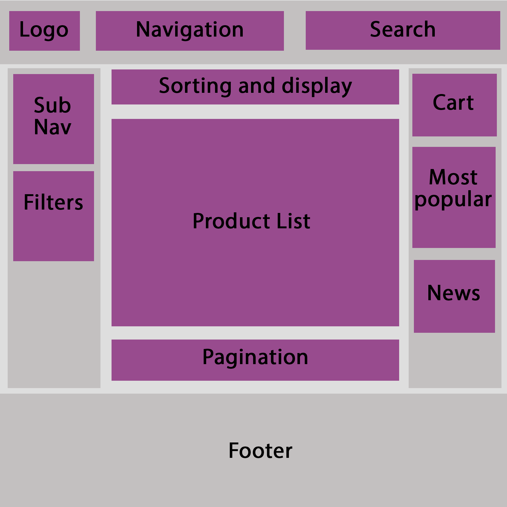
Building a Product Catalog
Building a Shopping Cart
User Registration and Authentication
Processing Payments
Building an Admin Panel
Deployment
Authentication and Refresh Token Flow
Server-Side Rendering
Continuous Integration and Continuous Deployment
Other Books You May Enjoy
Customer Reviews


