Sign In Start Free Trial
Account

Add to playlist

Create a Playlist

Modal Close icon
You need to login to use this feature.
  • Book Overview & Buying Learning Tableau 2022
  • Table Of Contents Toc
  • Feedback & Rating feedback
Learning Tableau 2022

Learning Tableau 2022

By : Joshua N. Milligan
4.8 (29)
close
close
Learning Tableau 2022

Learning Tableau 2022

4.8 (29)
By: Joshua N. Milligan

Overview of this book

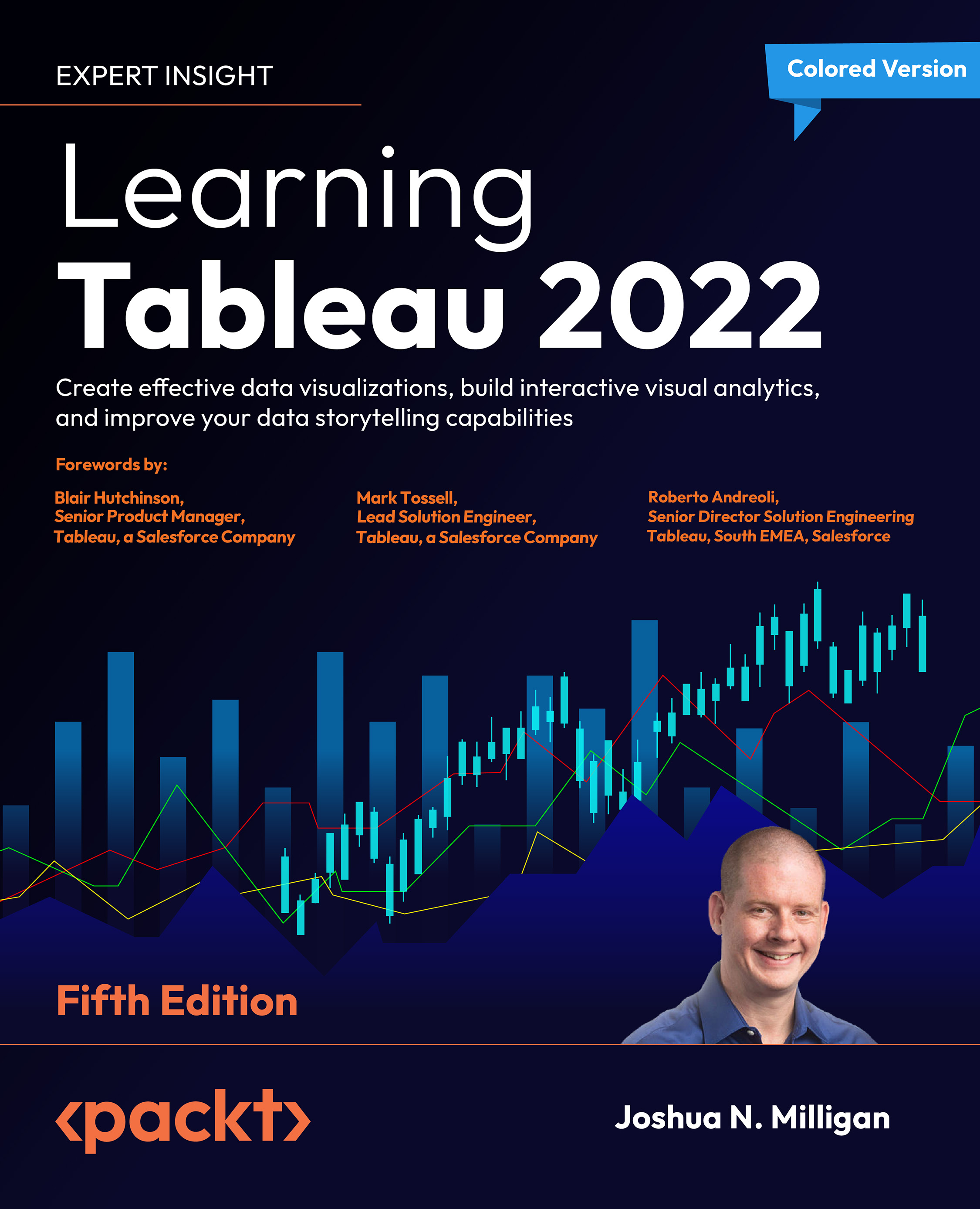
Learning Tableau 2022 helps you get started with Tableau and data visualization, but it does more than just cover the basic principles. It helps you understand how to analyze and communicate data visually, and articulate data stories using advanced features. This new edition is updated with Tableau’s latest features, such as dashboard extensions, Explain Data, and integration with CRM Analytics (Einstein Analytics), which will help you harness the full potential of artificial intelligence (AI) and predictive modeling in Tableau. After an exploration of the core principles, this book will teach you how to use table and level of detail calculations to extend and alter default visualizations, build interactive dashboards, and master the art of telling stories with data. You’ll learn about visual statistical analytics and create different types of static and animated visualizations and dashboards for rich user experiences. We then move on to interlinking different data sources with Tableau’s Data Model capabilities, along with maps and geospatial visualization. You will further use Tableau Prep Builder’s ability to efficiently clean and structure data. By the end of this book, you will be proficient in implementing the powerful features of Tableau 2022 to improve the business intelligence insights you can extract from your data.
Table of Contents (20 chapters)
close
close
18
Other Books You May Enjoy
19
Index

Advanced visualizations – when and why to use them

The visualization types we’ve seen up to this point will answer many, if not most, of the questions you have about your data. If you are asking questions of when?, then a time series is the most likely solution. If you are asking how much?, a bar chart gives a good, quick result. But there are times when you’ll ask questions that are better answered with a different type of visualization. For example, movement or flow might be best represented with a Sankey diagram. How many? might be best answered with a unit or symbol chart.

Comparing changes in ranks or absolute values might be best accomplished with a slope or bump chart. The visualizations that follow are not what you will use as you first explore the data. But as you dive deeper into your analysis and want to know or communicate more, you might consider some of the options in this chapter.

Each of the visualizations in this chapter is created using...
Unlock full access

Continue reading for free

A Packt free trial gives you instant online access to our library of over 7000 practical eBooks and videos, constantly updated with the latest in tech
bookmark search playlist download font-size

Change the font size

margin-width

Change margin width

day-mode

Change background colour

Close icon Search
Country selected

Close icon Your notes and bookmarks

Delete Bookmark

Modal Close icon
Are you sure you want to delete it?
Cancel
Yes, Delete

Confirmation

Modal Close icon
claim successful

Buy this book with your credits?

Modal Close icon
Are you sure you want to buy this book with one of your credits?
Close
YES, BUY