


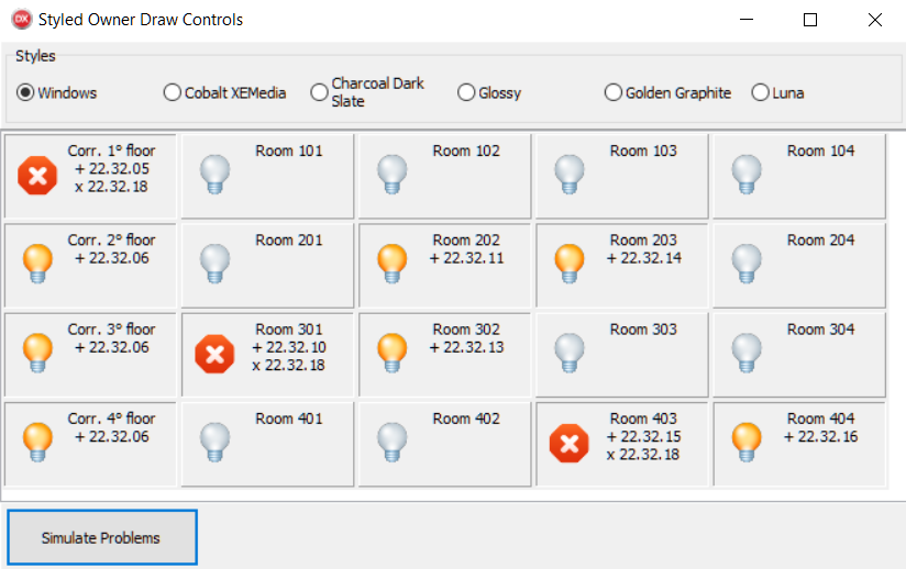
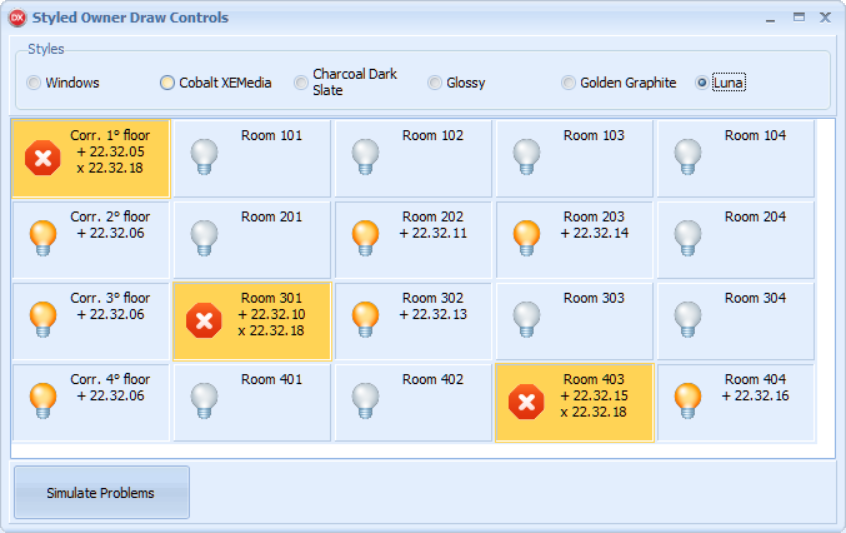
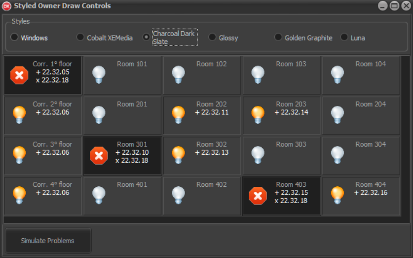
Owner-draw controls are powerful. They allow you to completely adapt your GUI to the needs of your users and potentially enable your application to display data in a more familiar way. In the end, owner-draw controls improve the user's experience with the application. However, owner-draw controls do not always fit in well with the VCL custom styles. Why? Because if you try to draw something by yourself, you could be tempted to use a fixed color, such clRed or clYellow, or you could be tempted to use the operating system color, such as clBtnFace or clWindow. In doing so, your owner-draw controls will not be style aware and will be drawn in the same way regardless of the current VCL style. In this recipe, you'll learn how to make custom graphics that remain relevant to the selected VCL style.
-
Book Overview & Buying
-
Table Of Contents

-
Feedback & Rating

Delphi Cookbook
By :
Delphi Cookbook
By:
Overview of this book
Delphi is a cross-platform integrated development environment (IDE) that supports rapid application development on different platforms, saving you the pain of wandering amid GUI widget details or having to tackle inter-platform incompatibilities.
Delphi Cookbook begins with the basics of Delphi and gets you acquainted with JSON format strings, XSLT transformations, Unicode encodings, and various types of streams. You’ll then move on to more advanced topics such as developing higher-order functions and using enumerators and run-time type information (RTTI). As you make your way through the chapters, you’ll understand Delphi RTL functions, use FireMonkey in a VCL application, and cover topics such as multithreading, using aparallel programming library and deploying Delphi on a server. You’ll take a look at the new feature of WebBroker Apache modules, join the mobile revolution with FireMonkey, and learn to build data-driven mobile user interfaces using the FireDAC database access framework. This book will also show you how to integrate your apps with Internet of Things (IoT).
By the end of the book, you will have become proficient in Delphi by exploring its different aspects such as building cross-platforms and mobile applications, designing server-side programs, and integrating these programs with IoT.
Table of Contents (12 chapters)
Preface
 Free Chapter
Delphi Basics
Becoming a Delphi Language Ninja
Knowing Your Friends – The Delphi RTL
Going Cross-Platform with FireMonkey
The Thousand Faces of Multithreading
Putting Delphi on the Server
Linux Development
Riding the Mobile Revolution with FireMonkey
Using specific platform features
Delphi and IoT
Other Books You May Enjoy
Customer Reviews


