-
Book Overview & Buying
-
Table Of Contents

-
Feedback & Rating

Tableau Desktop Specialist Certification
By :
Tableau Desktop Specialist Certification
By:
Overview of this book
The Tableau Desktop Specialist certification is fundamental for any data visualization professional who works in the field with Tableau.
This book gets you started by covering the exam format, Tableau basics, and best practices for preparing data for analysis and visualization. It also builds on your knowledge of advanced Tableau topics to get you up to speed with the essential domains and domain objectives. Although the guide provides an outline and starting point to key in on what needs to be understood before the examination, it also delivers in context to give you a strong understanding of each piece before taking the exam. Instructions on how to get hands on with examples, a common data source, and suggested elements are also included. Understanding the concepts will not only assist you in passing the examination, but will also help you work effectively with the tool in your workspace.
By the end of this book, you'll be able to efficiently prepare for the certification exam with the help of mock tests, detailed explanations, and expert advice from the author.
Table of Contents (17 chapters)
Preface

Part 1: Introduction to Tableau
 Free Chapter
Chapter 1: Tableau Desktop Specialist Certification Overview
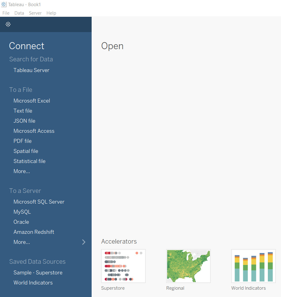
Chapter 2: Data Ingestion
Chapter 3: How to Interpret Data in a Tableau Visualization
Chapter 4: Working with Dimensions, Measures, and Marks (Oh My)
Chapter 5: Calculations and Functions Syntax
Part 2: Mastering the Exam
Chapter 6: Connecting to and Preparing Data
Chapter 7: Understanding and Creating Fundamental Charts in Tableau
Chapter 8: Data Organization and Worksheet Analytics
Chapter 9: Sharing Insights
Part 3: The Final Prep
Chapter 10: Exam Preparation
Chapter 11: Mock Test
Index
Other Books You May Enjoy
Customer Reviews