-
Book Overview & Buying
-
Table Of Contents

-
Feedback & Rating

Hands-On Data Analysis with Pandas
By :
Hands-On Data Analysis with Pandas
By:
Overview of this book
Extracting valuable business insights is no longer a ‘nice-to-have’, but an essential skill for anyone who handles data in their enterprise. Hands-On Data Analysis with Pandas is here to help beginners and those who are migrating their skills into data science get up to speed in no time.
This book will show you how to analyze your data, get started with machine learning, and work effectively with the Python libraries often used for data science, such as pandas, NumPy, matplotlib, seaborn, and scikit-learn.
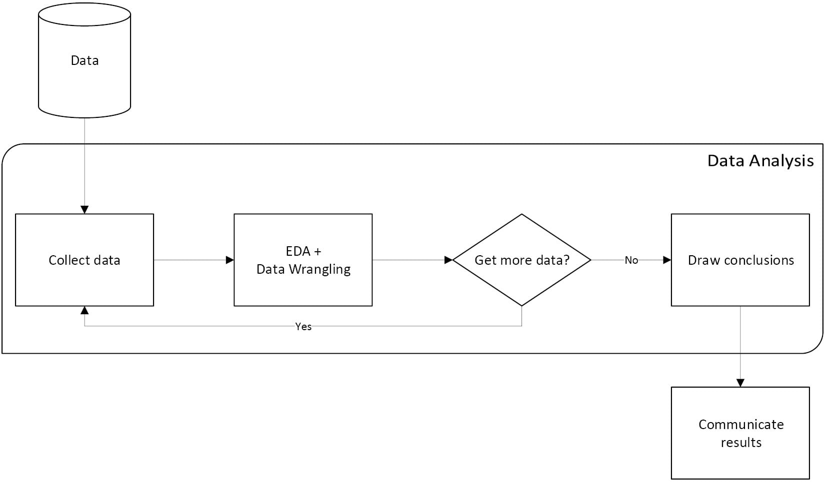
Using real-world datasets, you will learn how to use the pandas library to perform data wrangling to reshape, clean, and aggregate your data. Then, you will learn how to conduct exploratory data analysis by calculating summary statistics and visualizing the data to find patterns. In the concluding chapters, you will explore some applications of anomaly detection, regression, clustering, and classification using scikit-learn to make predictions based on past data.
This updated edition will equip you with the skills you need to use pandas 1.x to efficiently perform various data manipulation tasks, reliably reproduce analyses, and visualize your data for effective decision making – valuable knowledge that can be applied across multiple domains.
Table of Contents (21 chapters)
Preface

Section 1: Getting Started with Pandas
 Free Chapter
Chapter 1: Introduction to Data Analysis
Chapter 2: Working with Pandas DataFrames
Section 2: Using Pandas for Data Analysis
Chapter 3: Data Wrangling with Pandas
Chapter 4: Aggregating Pandas DataFrames
Chapter 5: Visualizing Data with Pandas and Matplotlib
Chapter 6: Plotting with Seaborn and Customization Techniques
Section 3: Applications – Real-World Analyses Using Pandas
Chapter 7: Financial Analysis – Bitcoin and the Stock Market
Chapter 8: Rule-Based Anomaly Detection
Section 4: Introduction to Machine Learning with Scikit-Learn
Chapter 9: Getting Started with Machine Learning in Python
Chapter 10: Making Better Predictions – Optimizing Models
Chapter 11: Machine Learning Anomaly Detection
Section 5: Additional Resources
Chapter 12: The Road Ahead
Solutions
Other Books You May Enjoy
Customer Reviews