Sign In Start Free Trial
Account

Add to playlist

Create a Playlist

Modal Close icon
You need to login to use this feature.
  • Book Overview & Buying Mastering Tableau 2021
  • Table Of Contents Toc
  • Feedback & Rating feedback
Mastering Tableau 2021

Mastering Tableau 2021

By : Marleen Meier, David Baldwin
4.2 (29)
close
close
Mastering Tableau 2021

Mastering Tableau 2021

4.2 (29)
By: Marleen Meier, David Baldwin

Overview of this book

Tableau is one of the leading business intelligence (BI) tools that can help you solve data analysis challenges. With this book, you will master Tableau's features and offerings in various paradigms of the BI domain. Updated with fresh topics including Quick Level of Detail expressions, the newest Tableau Server features, Einstein Discovery, and more, this book covers essential Tableau concepts and advanced functionalities. Leveraging Tableau Hyper files and using Prep Builder, you’ll be able to perform data preparation and handling easily. You’ll gear up to perform complex joins, spatial joins, unions, and data blending tasks using practical examples. Next, you’ll learn how to execute data densification and further explore expert-level examples to help you with calculations, mapping, and visual design using Tableau extensions. You’ll also learn about improving dashboard performance, connecting to Tableau Server and understanding data visualization with examples. Finally, you'll cover advanced use cases such as self-service analysis, time series analysis, and geo-spatial analysis, and connect Tableau to Python and R to implement programming functionalities within it. By the end of this Tableau book, you’ll have mastered the advanced offerings of Tableau 2021 and be able to tackle common and advanced challenges in the BI domain.
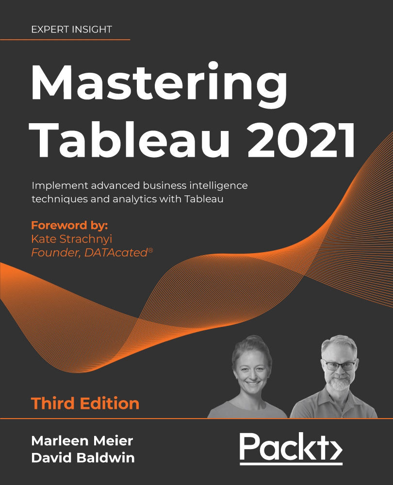
Table of Contents (18 chapters)
close
close
16
Another Book You May Enjoy
17
Index

Visualization design theory

Any discussion about designing dashboards should begin with information about constructing well-designed content. The quality of the dashboard's layout, and the utilization of technical tips and tricks, do not matter if the content is subpar. In other words, we should first consider the worksheets displayed on dashboards and ensure that those worksheets are well-designed. Therefore, our discussion will begin with a consideration of visualization design principles. Regarding these principles, it's tempting to declare a set of rules, such as the following:

  • To plot change over time, use a line graph.
  • To show breakdowns of the whole, use a treemap.
  • To compare discrete elements, use a bar chart.
  • To visualize correlations, use a scatter plot.

But of course, even a cursory review of this list brings to mind many variations and alternatives! Thus, in the next section, Formatting rules, we will consider various rules...

Unlock full access

Continue reading for free

A Packt free trial gives you instant online access to our library of over 7000 practical eBooks and videos, constantly updated with the latest in tech
bookmark search playlist download font-size

Change the font size

margin-width

Change margin width

day-mode

Change background colour

Close icon Search
Country selected

Close icon Your notes and bookmarks

Delete Bookmark

Modal Close icon
Are you sure you want to delete it?
Cancel
Yes, Delete

Confirmation

Modal Close icon
claim successful

Buy this book with your credits?

Modal Close icon
Are you sure you want to buy this book with one of your credits?
Close
YES, BUY