

-
Book Overview & Buying
-
Table Of Contents

-
Feedback & Rating

Design Made Easy with Inkscape
By :
Design Made Easy with Inkscape
By:
Overview of this book
With the power and versatility of the Inkscape software, making charts, diagrams, illustrations, and UI mockups with infinite resolution becomes enjoyable. If you’re looking to get up to speed with vector illustration in no time, this comprehensive guide has got your back! Design Made Easy with Inkscape is easy to follow and teaches you everything you need to know to create graphics that you can use and reuse forever, for free!
You’ll benefit from the author’s industry experience as you go over the basics of vector illustration, discovering tips and tricks for getting professional graphics done fast by leveraging Inkscape's powerful toolset. This book teaches by example, using a great variety of use cases from icons and logos to illustration, web design, and product design. You’ll learn about hotkeys and take a best-practices approach developed over ten years of using Inkscape as a design tool in production. What’s more, this book also includes links to free graphics resources that you can use in all your projects.
Whether you’re a new user or a professional, by the end of this book, you’ll have full understanding of how to use Inkscape and its myriad of excellent features to make stunning graphics for your projects.
Table of Contents (21 chapters)
Preface

Part 1: Finding Your Way Around
 Free Chapter
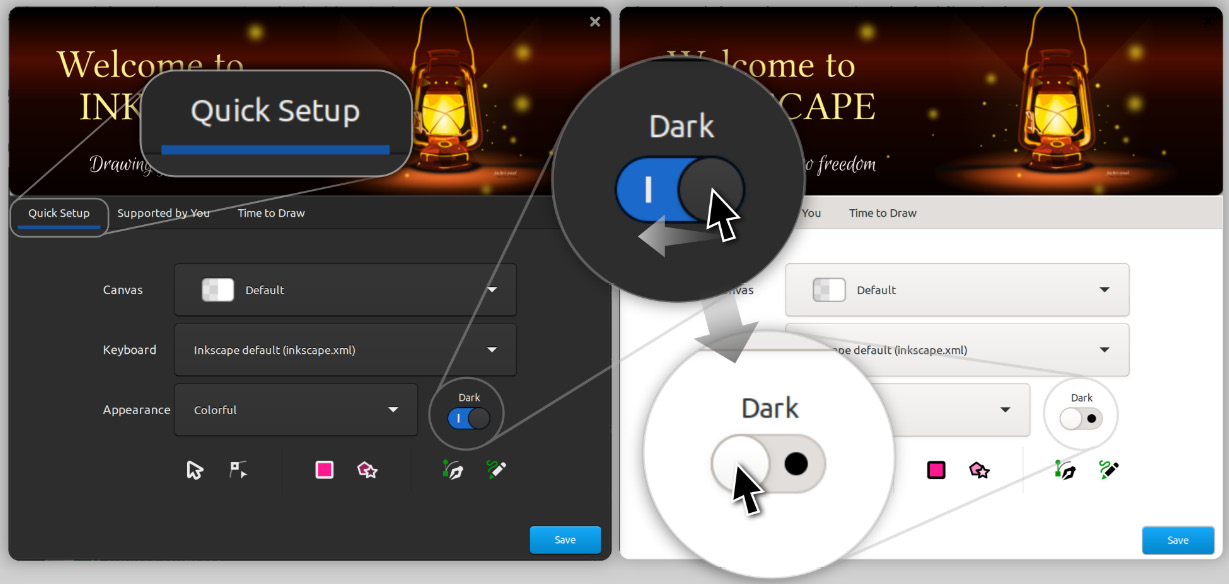
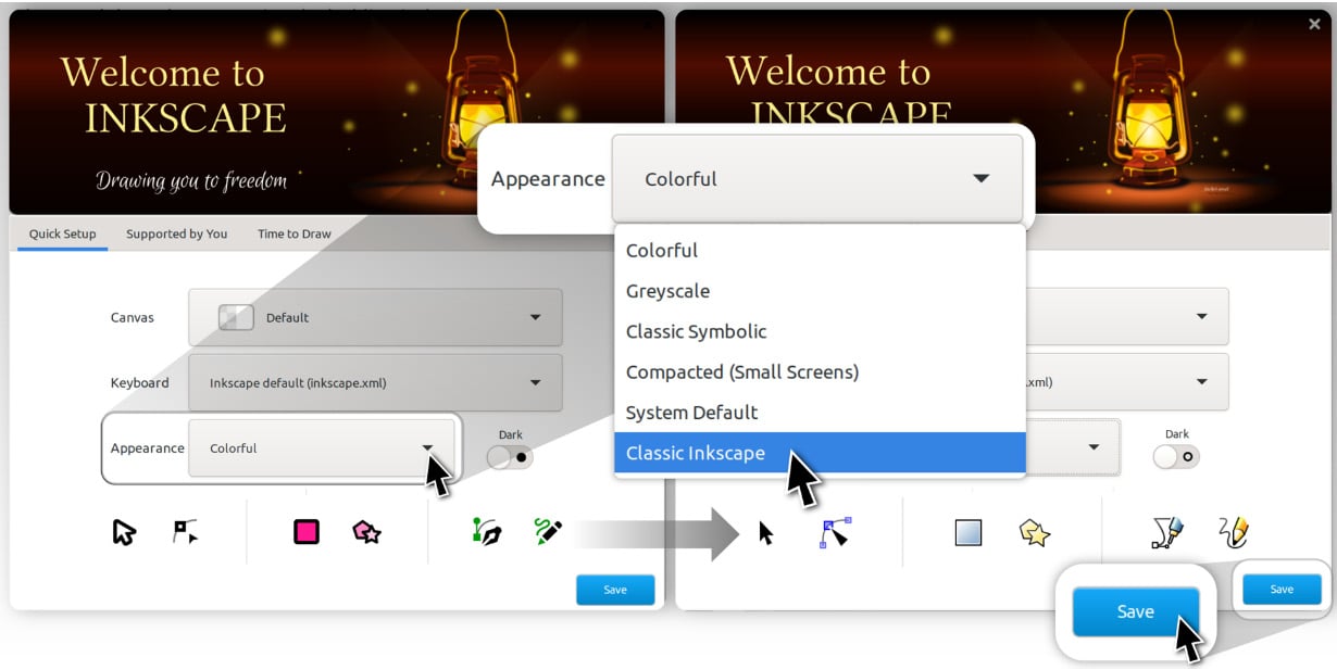
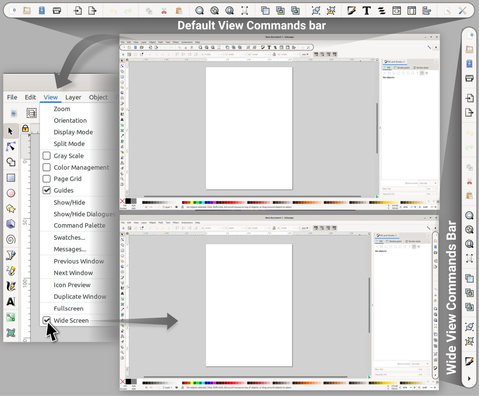
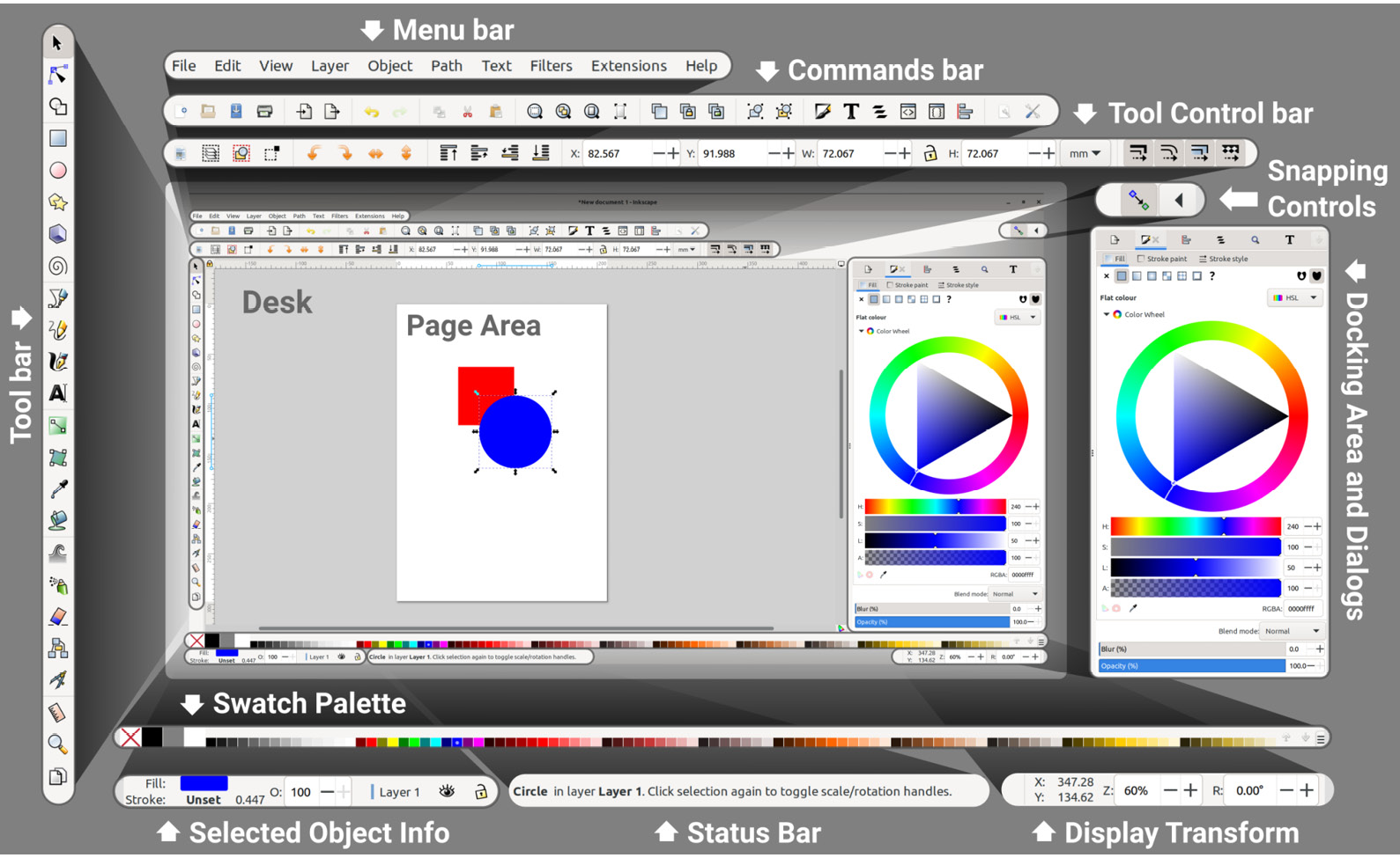
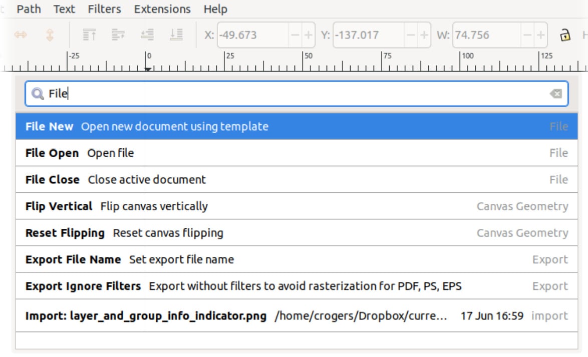
Chapter 1: The Inkscape Interface
Chapter 2: Moving and Styling Shapes
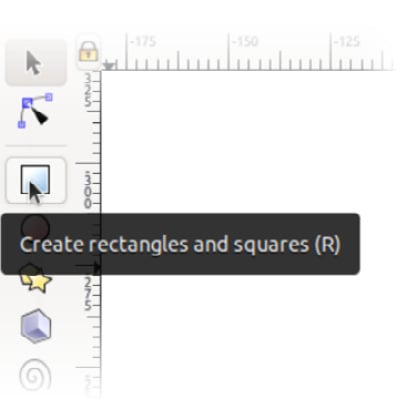
Chapter 3: Drawing Shapes with the Shape Tools
Chapter 4: Automatic Shape Alignment in Inkscape
Chapter 5: Node Editing – Modifying Your Shapes with Nodes and Curves
Part 2: Advanced Shape Editing
Chapter 6: Fast Shape Editing with Path Operations and the Shape Builder Tool
Chapter 7: Using Text in Inkscape
Chapter 8: Advanced Shading and Coloring
Chapter 9: Clips and Masks
Chapter 10: Automation with Clones and Linked Files
Part 3: Inkscape’s Power Tools
Chapter 11: Organization Using Layers
Chapter 12: Live Path Effects
Chapter 13: Filters and Extensions
Chapter 14: Vectorizing with Trace Bitmap
Chapter 15: Document Properties, Pages, Exporting, and Printing
Index
Customer Reviews


